
티스토리 뷰
목차
유리, 금속, 피펫과 포뮬러 물성을 활용한 클리니컬 스킨케어 화보 AI 프롬프트와 제품 보존 검수법을 공유합니다.
처음에는 저도 "비커랑 스포이드 몇 개 넣으면 실험실 분위기 나겠지"라고 생각했습니다. 그런데 결과물을 보자마자 느꼈습니다. 완전히 틀렸다는 걸. 오브제는 다 있는데 왜 이게 과학 교육 자료처럼 보이지? 그 물음에서 클리니컬 에디토리얼 화보 프롬프트 설계를 처음부터 다시 뜯어보게 됐습니다. 생성형 이미지로 하이엔드 스킨케어 화보를 만들고 싶은 분이라면, 오브제 개수보다 구조 설계가 먼저라는 이야기를 지금 드리려 합니다.
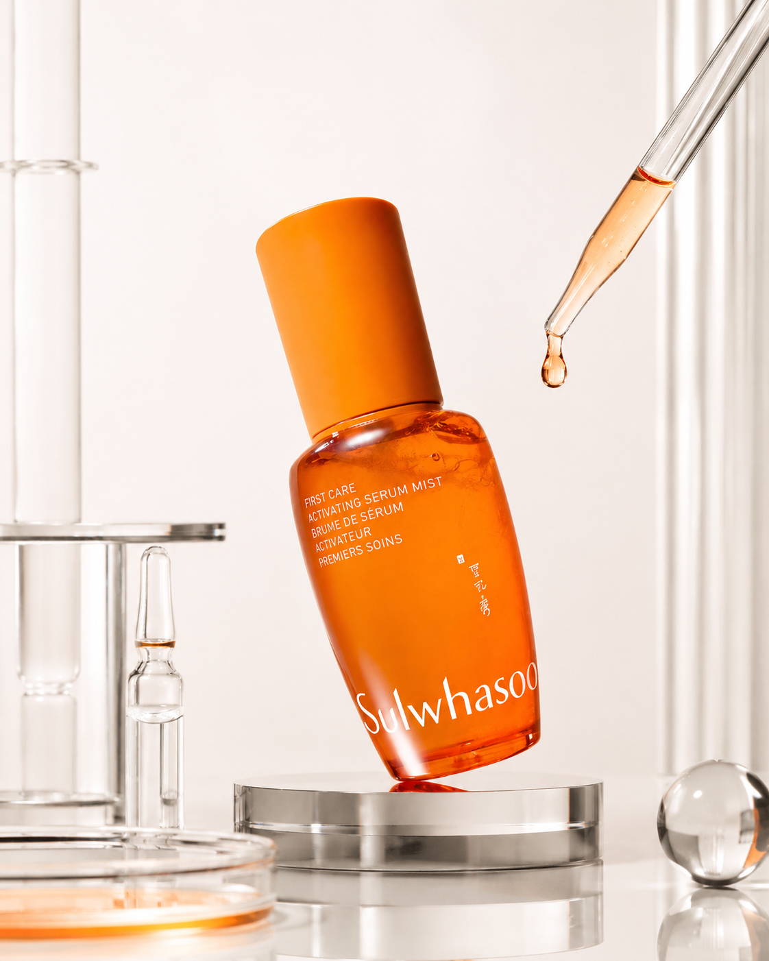
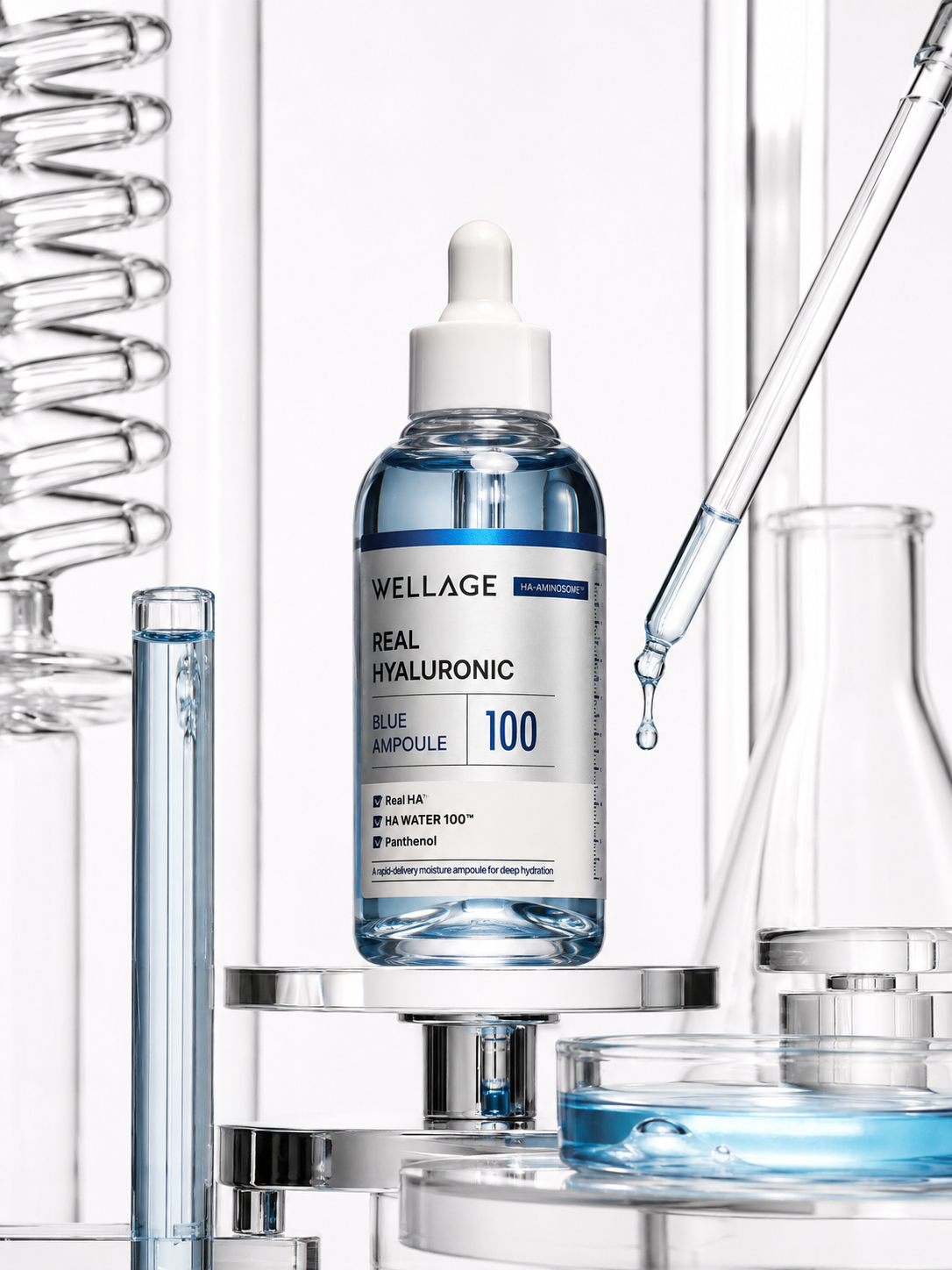

구조 설계: 오브제가 아니라 '시각적 논리'가 먼저입니다
제가 직접 여러 차례 시도해 봤는데, 실험실 관련 소품을 많이 넣을수록 오히려 이미지가 산만해졌습니다. 비커, 시험관, 페트리 접시, 앰플을 한꺼번에 배치했더니 제품보다 배경이 더 눈에 들어오는 상황이 반복됐습니다. 문제는 오브제의 양이 아니라 각각의 오브제가 제품과 어떤 시각적 근거로 연결되어 있는가였습니다.
클리니컬 에디토리얼 화보에서 가장 핵심이 되는 개념은 비주얼 히어라키(Visual Hierarchy)입니다. 여기서 비주얼 히어라키란 시청자의 시선이 이미지 안에서 어느 순서로 이동하는지를 설계하는 구도의 논리 체계를 말합니다. 제품이 첫 번째 시선을 받고, 포뮬러 컬러가 두 번째, 유리 구조물이 세 번째 순서로 눈에 들어오도록 배치할 때 비로소 하이엔드 뷰티 캠페인처럼 읽힙니다. 이 순서가 무너지면 아무리 고급 소재를 써도 스톡 이미지처럼 보입니다.
실제로 프롬프트를 수정하면서 가장 효과가 컸던 변화는 오브제를 줄이는 것이었습니다. 투명 유리관 하나, 대각선으로 놓인 피펫 하나, 페트리 접시 하나. 이 세 가지만 남기고 나머지를 제거하자 제품이 전면에 드러나기 시작했습니다. 대각선 피펫이 만드는 사선 구도가 수직·수평 유리 구조와 만나면서 논리적인 레이아웃이 형성됐고, 하이키(High-Key) 조명 아래에서 크롬과 보로실리케이트 유리의 반사광이 제품 쪽으로 시선을 집중시켰습니다.
하이키 조명이란 화면 전체를 밝고 균일하게 채우는 촬영 기법으로, 클리니컬 뷰티 화보에서 화이트 배경과 투명 소재의 광학적 특성을 가장 잘 살릴 수 있는 방식입니다. 이 조명 설정을 프롬프트에 명시하자 이전까지 비논리적으로 튀던 그림자와 반사광이 제품 중심으로 정렬됐습니다. 솔직히 이건 예상 밖이었습니다. 조명한 줄이 구도 전체를 이렇게 바꿀 줄 몰랐습니다.
프롬프트 구조 설계 시 확인해야 할 핵심 항목
- 제품 보존(Product Preservation): 로고, 캡 구조, 패키징 비율이 원본과 일치하는지 별도 항목으로 명시
- 비주얼 히어라키(Visual Hierarchy): 제품 → 포뮬러 컬러 → 유리 구조 순서로 시선 흐름을 설계
- 오브제 수 제한: 핵심 소품 3개 이내로 제한하고 각각의 역할을 프롬프트에 명시
- 조명 설정: 하이키 조명 + 리무(Rim Light·제품 외곽을 따라 생기는 엣지 하이라이트) 명시
- 네거티브 조건: 교육용 과학 이미지, 스톡 이미지풍 배치, 레이블 가림을 명확히 금지
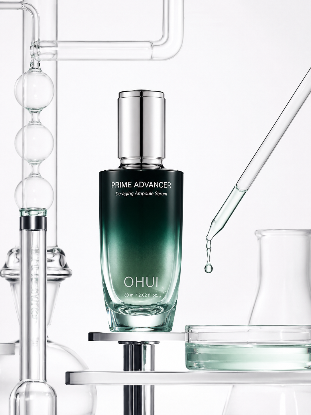
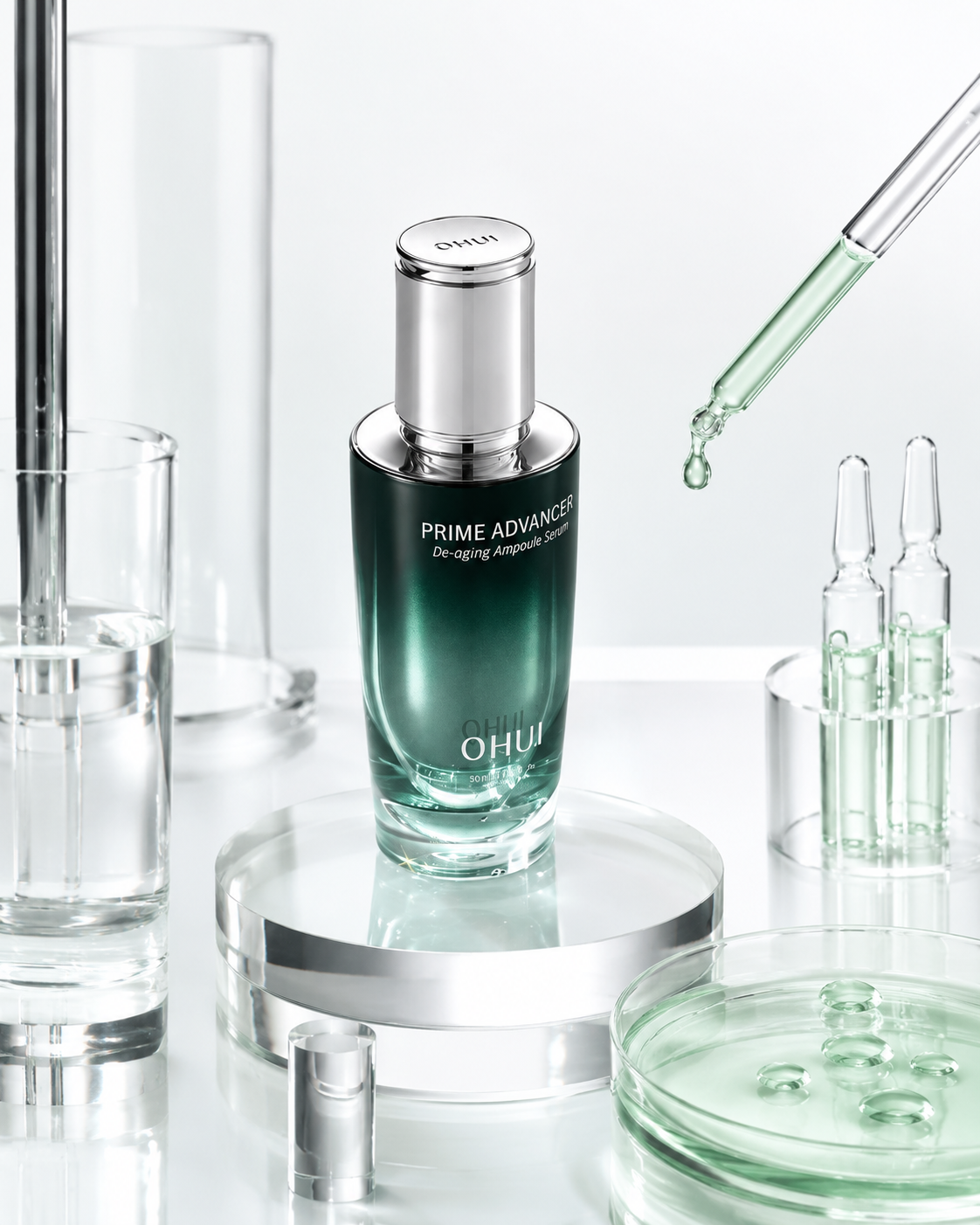
물성 표현과 제품 보존: 가장 오래 걸린 두 가지
구조 설계가 어느 정도 잡힌 뒤에도 계속 걸리는 지점이 두 군데 있었습니다. 하나는 유리와 액체의 물성 표현이고, 다른 하나는 제품 외관 보존이었습니다. 제 경험상 이 두 가지가 동시에 잘 구현된 이미지가 나오는 비율이 가장 낮았고, 그래서 이 부분에 가장 많은 시도를 반복했습니다.
물성 표현에서 핵심은 포뮬러의 점도(Viscosity)와 표면장력(Surface Tension)을 얼마나 구체적으로 입력하느냐입니다. 점도란 액체가 흐르는 속도에 대한 저항값으로, 수분 세럼처럼 묽고 빠르게 퍼지는 제형과 리치 크림처럼 무겁고 천천히 흐르는 제형은 피펫 끝에 맺히는 방울의 크기와 늘어지는 방식이 전혀 다릅니다. 처음에는 단순히 "a droplet of serum"이라고만 썼는데, 방울이 매번 비현실적으로 크거나 물처럼 투명하게 나왔습니다. "a single precisely controlled droplet with high surface tension, low viscosity, translucent pale texture"처럼 물성을 세분화해 입력하자 피펫 끝에 맺힌 방울이 훨씬 설득력 있게 표현되기 시작했습니다.
유리 굴절 표현도 마찬가지였습니다. 보로실리케이트 유리관 안에 들어 있는 액체가 굴절(Refraction)을 일으켜 배경의 선이 꺾이거나 제품 컬러가 유리 내부에서 왜곡되는 장면, 그게 클리니컬 에디토리얼 화보를 화장품 광고처럼 보이게 만드는 핵심 디테일이라는 걸 한참 뒤에 깨달았습니다. 굴절이란 빛이 서로 다른 밀도의 물질을 통과할 때 방향이 바뀌는 광학 현상으로, 유리와 액체가 함께 있는 장면에서 이 현상을 얼마나 정확하게 묘사하느냐가 이미지의 퀄리티를 결정합니다. 출처: ScienceDirect - Borosilicate Glass
제품 보존 문제는 솔직히 아직도 완벽하게 해결되지 않았습니다. 프롬프트에 "preserve the original logo, typography, cap structure, packaging shape"를 반복해서 써도 생성 과정에서 병 비율이 달라지거나 캡 디자인이 단순화되는 경우가 꽤 자주 발생합니다. 제가 직접 수십 번 비교해 본 결과, 제품 보존 조건을 프롬프트 맨 앞쪽 별도 섹션으로 분리해서 넣고, 네거티브 조건에서 "do not distort, redesign, simplify the original packaging"을 다시 한번 명시할 때 보존율이 눈에 띄게 높아졌습니다. 그래도 생성된 이미지를 그대로 완성본으로 쓰기보다는 목업이나 리터칭 작업을 병행하는 것이 현실적이라고 생각합니다. 생성형 이미지 도구는 완성품을 만들어주는 기계가 아니라 비주얼 방향성을 빠르게 프로토타이핑하는 수단에 가깝습니다.
참고로 Adobe 공식 블로그에서도 생성형 이미지의 브랜드 일관성 유지를 위해서는 레퍼런스 이미지 입력과 반복적인 프롬프트 조정이 병행되어야 한다고 권고하고 있습니다.
출처: Adobe Blog - Generative AI & Brand Consistency
직접 개발한 프롬프트 공유
그래서, 프롬프트로 어떤것을 기입해야 위와 같은
클리니컬 에디토리얼 화보를 저도 손쉽게 만들 수 있나요?
A1. 하이엔드 클리니컬 스킨케어 화보 프롬프트 축약형
# ROLE
Act as a world-class luxury beauty Art Director, Clinical Skincare Creative Director, Material Stylist, Set Designer, and Commercial Photographer.
Transform the uploaded skincare product into a premium clinical editorial campaign that communicates cosmetic efficacy, formulation intelligence, purity, precision, and refined luxury.
# PRODUCT PRESERVATION
Use the uploaded product as the exact visual reference.
Preserve its original logo, typography, label placement, packaging shape, proportions, cap, dispenser, material, transparency, color, and finish. Keep the front label clearly visible and undistorted.
Do not redesign the package, alter the branding, cover the label, or add fictional text, logos, ingredients, or symbols. The product must remain immediately recognizable.
# CREATIVE DIRECTION
Analyze the product’s category, formula, packaging material, dominant colors, transparency, texture, applicator, brand mood, and perceived efficacy.
Based on this analysis, create one clear scientific skincare narrative, such as cellular hydration, skin-barrier reinforcement, controlled absorption, ingredient activation, moisture circulation, soothing recovery, microencapsulation, or clinical correction.
The result should feel scientific yet luxurious, technical yet sensorial, clean yet visually sophisticated—not medical, pharmaceutical, or science-fiction themed.
# LABORATORY STYLING
Select only a few premium laboratory-inspired props that support the product concept:
clear borosilicate glass tubes, precision pipettes, transparent ampoules, petri dishes, optical glass blocks, curved glassware, chrome cylinders, polished stainless-steel platforms, clear acrylic structures, or microfluidic channels.
Every prop must frame, support, connect to, or direct attention toward the product. Avoid random or excessive laboratory equipment.
Place the product on a believable glass, acrylic, chrome, or stainless-steel structure with accurate weight, balance, contact shadows, and physical support. Never let the product float without a logical structure.
# FORMULA AND LIQUID
Represent the formula with realistic color, transparency, viscosity, gloss, refraction, surface tension, meniscus, and droplet behavior.
Use one restrained formula sample inside a pipette, ampoule, glass tube, petri dish, or transparent channel. When appropriate, show one precisely controlled droplet at the pipette tip.
Avoid large splashes, slime-like textures, excessive bubbles, chaotic fluid motion, or unrealistic floating liquid.
# COLOR AND BACKGROUND
Extract a cohesive palette from the product:
one Hero Color, one Formula Color, one Secondary Color, one Neutral Background Color, and one Metallic Highlight Color.
Use the product or formula color as the only strong chromatic accent. Keep the environment predominantly luminous white, cool white, pale gray, transparent, silver, or softly tinted.
Create a spacious high-key studio background with subtle tonal depth, transparent layering, fine structural lines, and generous negative space.
# COMPOSITION
Create a premium vertical macro beauty composition.
Position the skincare product as the unmistakable hero. Use strong vertical and horizontal alignment, measured spacing, balanced asymmetry, layered transparent structures, cropped glass objects at the edges, and one elegant diagonal pipette or applicator.
The composition should feel architectural, controlled, logical, and editorial. All visual lines should guide the eye toward the product.
# LIGHTING AND MATERIAL REALISM
Use luxury high-key commercial studio lighting with large diffused softboxes, controlled frontal light, precise rim lighting, clean specular highlights, subtle backlighting, accurate contact shadows, and crisp separation from the white background.
Render every material according to its real optical properties:
clear glass with accurate thickness and refraction, formula liquid with believable viscosity and surface tension, chrome with controlled reflections, acrylic visually distinct from glass, and packaging with its authentic gloss, transparency, and texture.
Professional medium-format macro photography, sharp product label, minimal lens distortion, controlled depth of field, refined reflections, ultra-photorealistic luxury advertising quality.
# NEGATIVE CONSTRAINTS
No food, flowers, fruits, botanical styling, spa props, towels, stones, candles, doctors, scientists, hands, hospital imagery, warning labels, molecular diagrams, added text, fictional branding, neon colors, cyberpunk lighting, dark industrial backgrounds, smoke, dramatic splashes, clutter, distorted packaging, covered labels, plastic-looking glass, weightless objects, generic stock photography, or obvious CGI.
The final image must read as a high-end skincare campaign first, a science-driven formulation concept second, and a refined clinical editorial photograph third.
A2. 초압축 공유용
Transform the uploaded skincare product into a high-end clinical beauty campaign. Preserve the exact logo, typography, packaging shape, proportions, cap, material, color, transparency, finish, and label placement. Do not redesign the product, cover the label, or add new text.
Analyze the product’s formula, efficacy, material, color palette, and brand identity, then create one sophisticated scientific concept such as cellular hydration, skin-barrier reinforcement, controlled absorption, ingredient activation, or clinical correction.
Place the product as the central hero on a transparent glass, acrylic, chrome, or polished stainless-steel structure. Surround it with only a few purposeful laboratory props such as borosilicate glass tubes, precision pipettes, ampoules, petri dishes, optical glass blocks, or microfluidic channels.
Show the formula with realistic transparency, viscosity, refraction, surface tension, meniscus, and one controlled droplet. Use the product or formula color as the only strong accent against a luminous white or cool-white high-key studio background.
Create a vertical macro composition with measured spacing, strong horizontal and vertical alignment, balanced asymmetry, generous negative space, layered transparent structures, and one elegant diagonal pipette directing attention toward the product.
Use luxury commercial lighting with diffused softboxes, precise rim light, clean specular highlights, accurate contact shadows, realistic glass refraction, controlled chrome reflections, and ultra-photorealistic medium-format beauty photography.
Avoid clutter, floating products, excessive equipment, dramatic splashes, added text, fictional branding, distorted packaging, neon colors, cyberpunk styling, medical imagery, generic spa props, plastic-looking materials, and obvious CGI.
결론
클리니컬 에디토리얼 화보 프롬프트를 처음 설계할 때 가장 많이 하는 실수는 오브제를 많이 넣으면 전문적으로 보일 것이라는 착각입니다. 제가 직접 수십 번의 시도를 반복하면서 확인한 건 반대였습니다. 줄여야 보입니다. 제품 중심의 비주얼 히어라키를 먼저 설계하고, 포뮬러의 점도와 표면장력을 구체적으로 기술하고, 제품 보존 조건을 프롬프트 구조 안에서 이중으로 명시하는 것. 이 세 가지를 갖추고 나서야 결과물이 안정적으로 달라지기 시작했습니다.
생성형 이미지 도구는 미술 감독의 판단을 대신해주는 게 아니라, 그 판단을 빠르게 시각화해 주는 프로토타이핑 수단입니다. 레퍼런스를 분석하는 눈과 결과물을 판단하는 기준을 먼저 갖춘 상태에서 반복적으로 조정할 때 비로소 재현 가능한 퀄리티가 만들어집니다. 한 번에 완벽한 결과를 기대하기보다, 제품 보존 → 물성 표현 → 구도 → 조명 → 컬러 순서로 각 항목을 하나씩 검증해 가는 방식이 결국 가장 빠른 길이라고 생각합니다.
이 글과 이어지는 내용은 스킨케어 AI 프롬프트 만드는 법, 하이엔드 뷰티 연출컷 만드는 법, 상업용 이미지 사이트 비교에 정리했습니다.
유리와 금속 질감이 무너지는 지점을 반복 테스트하며 찾은 프롬프트입니다.
'프롬프트 아카이브' 카테고리의 다른 글
| 쿠션 파운데이션 AI 이미지 프롬프트: 제품 구조·로고 보존 방법 (4) | 2026.07.24 |
|---|---|
| 스킨케어 AI 프롬프트 만드는 법: 브랜드 보이스와 고객 세분화 (0) | 2026.07.21 |
| 3D 캐릭터 AI 이미지 (무드보드, 캐릭터 콜라주, Y2K) (0) | 2026.07.19 |
| 하이엔드 뷰티 연출컷 (4가지 핵심포인트, 사용 방법) (0) | 2026.07.17 |
| AI 음식 포스터 프롬프트 작성법: 에디토리얼 디자인 원문 공유 (0) | 2026.07.17 |