
티스토리 뷰
목차

음식이 주인공으로 보이는 에디토리얼 포스터를 만들기 위한 AI 프롬프트 구조와 권장 환경, 원문을 공유합니다.
안녕하세요!
오늘은 디자인 실무나 개인 프로젝트에 바로 활용하기 좋은 '고퀄리티 생성형 이미지 음식 포스터 프롬프트'를 여러분께 공유해 드리고자 합니다. AI 이미지 생성기를 활용해 음식 포스터를 만들어 보신 분들이라면 아마 깊이 공감하실 텐데요. 이미지를 생성하다 보면 음식보다 배경이 더 눈에 띄거나, 색감이 지나치게 쨍하게 나오는 경우가 많습니다.
혹은 흔한 템플릿(ex. 캔바, 미리캔버스 등)을 그대로 가져다 쓴 것 같은 다소 아쉬운 결과물이 나오기도 하죠.
저 역시 수십 번의 테스트와 시행착오를 거쳤고, 그 결과 실제 광고 디자이너가 작업한 듯한 에디토리얼 스타일에 최적화된 프롬프트를 완성하게 되었습니다.
오늘 그 결과물을 아낌없이 공유해 드립니다.
사용 전 꼭 확인해 주세요! (권장 환경)
ChatGPT 최적화
본 프롬프트는 챗GPT(ChatGPT) 환경에 맞춰 제작되었습니다. 챗GPT에 먼저 프롬프트를 입력하여 내용을 생성한 뒤, 이를 이미지 생성 AI에 적용하시는 프로세스를 거치면 가장 안정적이고 훌륭한 결과물을 얻으실 수 있습니다.
타 AI 모델 사용 시 주의점
제미나이(Gemini) 등 다른 생성형 AI에서도 충분히 사용이 가능합니다. 다만, AI마다 프롬프트를 해석하는 알고리즘이 다르기 때문에 결과물의 뉘앙스가 다소 달라질 수 있다는 점 참고 부탁드립니다.
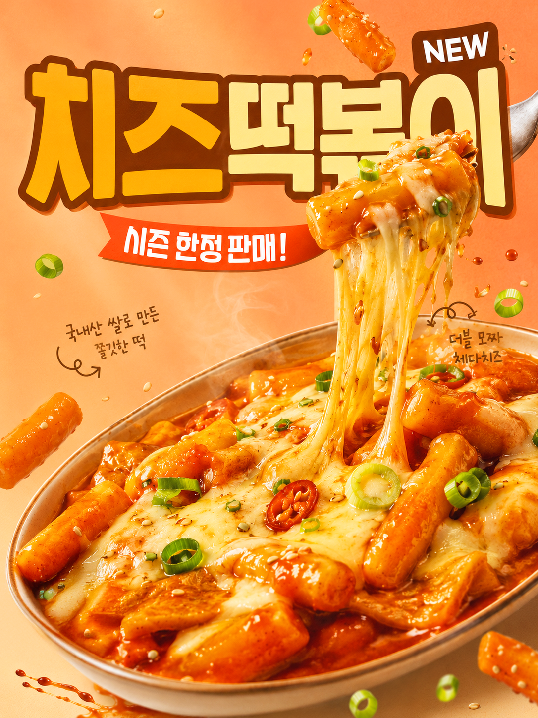
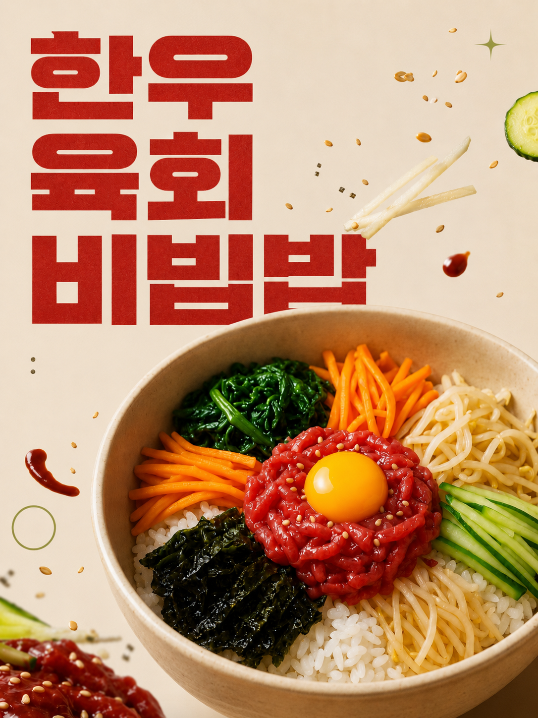
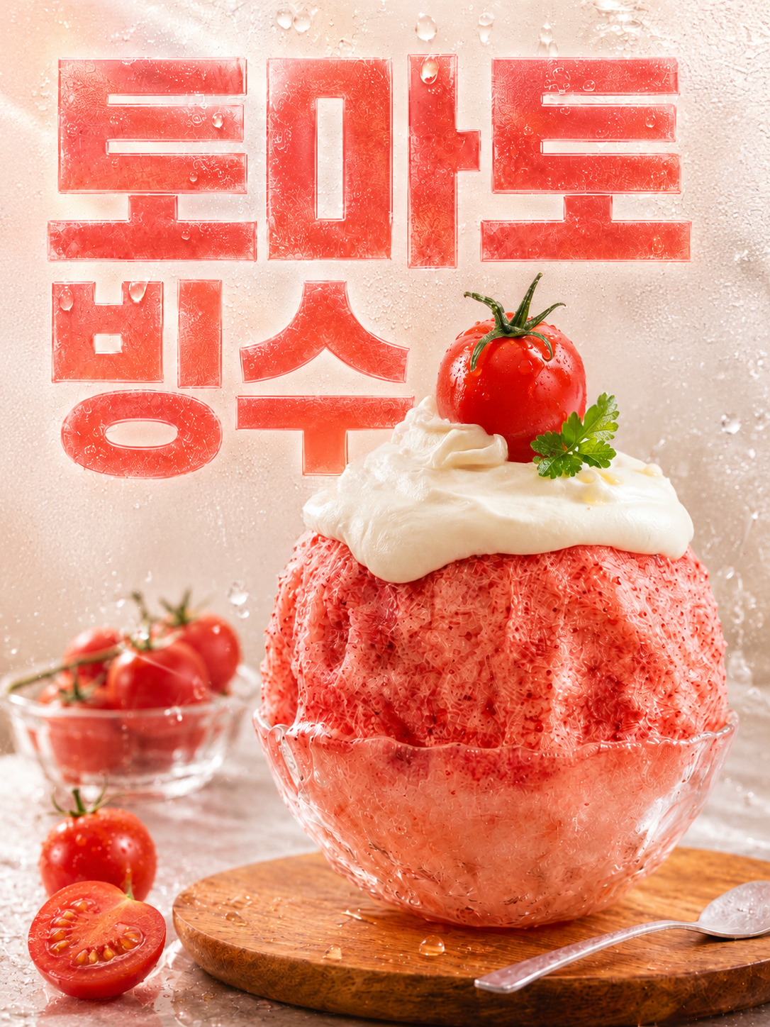
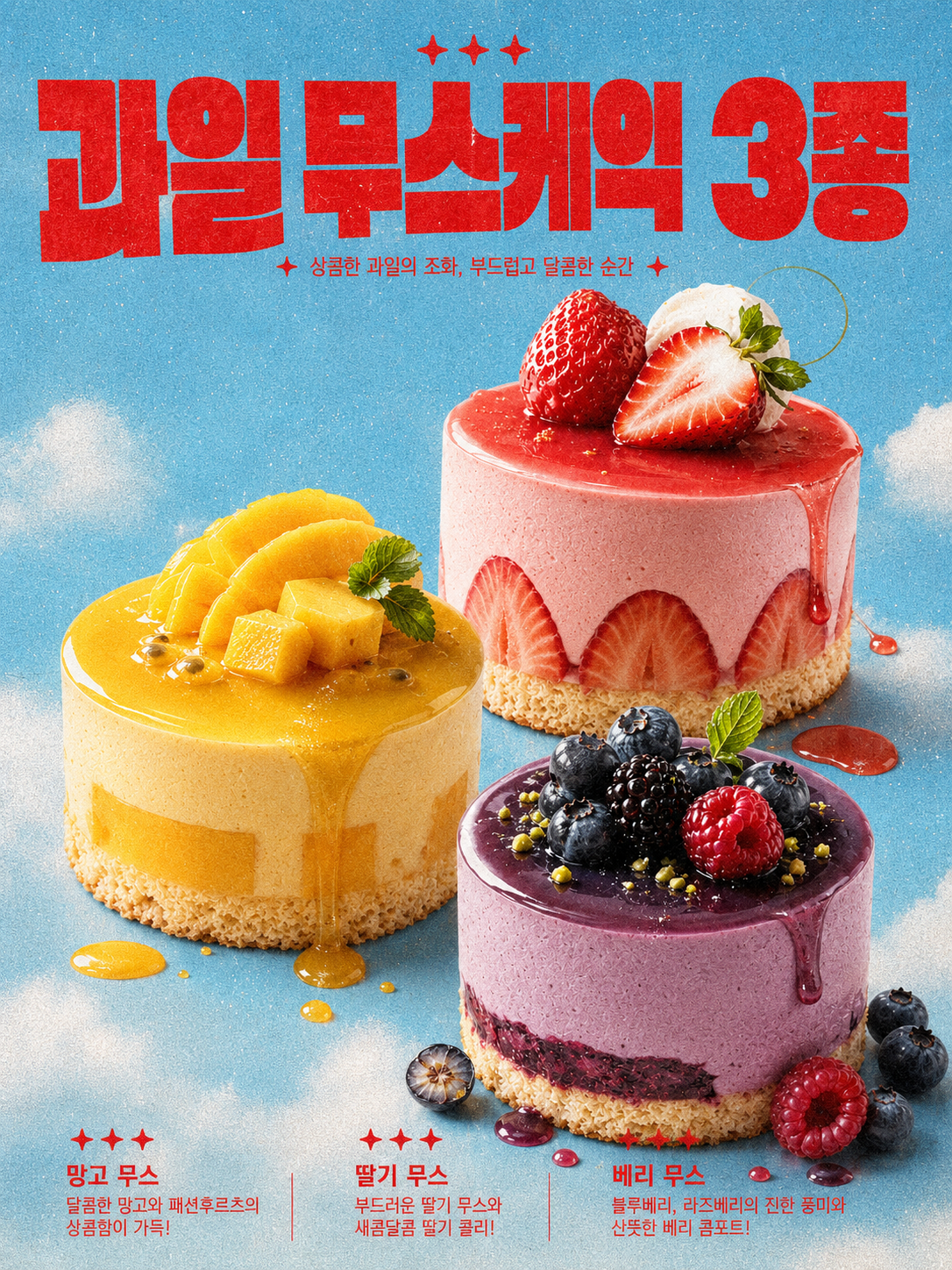
AI 음식 포스터 프롬프트 원문
아래의 프롬프트 코드를 자유롭게 복사하여 사용하시면 됩니다.
(※ 첫 줄의 '음식 이름' 부분에 원하시는 음식 명을 넣어서 사용해 주세요!)
MAIN HEADLINE: [음식 이름]
Transform the uploaded food photo into a premium vertical food-branding campaign poster. Preserve the food’s recognizable ingredients, cooking style, silhouette, serving form, and authentic texture.
First analyze the food’s dominant and accent colors, ingredients, garnish, texture, temperature, cuisine style, visual weight, and emotional mood. Based on this analysis, automatically create a cohesive palette consisting of one Hero Color, one Background Color, one Typography Color, one Accent Color, and one Neutral Color.
Do not use a fixed background color. Select the most effective background according to the food: complementary contrast, analogous harmony, light neutral, deep editorial contrast, ingredient-derived color, or muted retro contrast. The background may use a solid color field, subtle paper grain, painted texture, restrained two-tone division, or gentle tonal transition. It must increase appetite and separate the food clearly without overpowering it. Avoid neon, fluorescent, muddy, or arbitrary colors.
Make the uploaded food the dominant hero, occupying approximately 40–55% of the composition. Enhance realistic moisture, gloss, steam, crispness, creaminess, sauce viscosity, fruit freshness, crumbs, and natural shadows. Use only relevant ingredients, sauces, herbs, spices, garnish, or tableware as supporting assets.
Create a bold editorial layout using asymmetrical balance, dynamic cropping, deliberate overlap, generous negative space, scale contrast, and clear depth. Automatically select the composition best suited to the food: one oversized hero, a three-item grouping, repeated forms, diagonal layout, triangular layout, stacked arrangement, or a disrupted modular grid.
Use the exact MAIN HEADLINE as the only readable text. Render it accurately in oversized ultra-bold grotesk typography inspired by Druk, Helvetica Neue Black, Neue Haas Grotesk, Monument Extended, or Suisse Int’l. The headline may be cropped, extend outside the frame, sit partially behind the food, or wrap around it. Do not use handwritten, script, bubble, rounded, decorative, or Canva-style fonts.
Add only a few restrained graphic accents such as stars, circles, arrows, dots, lines, registration marks, or ingredient-inspired symbols. Keep them secondary.
Use premium commercial food photography with lighting adapted to the food’s character, realistic texture, crisp shadows, rich color separation, subtle editorial grain, and world-class creative-agency quality.
Vertical poster, 3:4 ratio, 1080 × 1440, full bleed, no borders, no frames, no mockup, ultra-detailed and photorealistic. Do not create a menu, flyer, coupon, brochure, recipe card, delivery banner, generic social template, artificial CGI food, unrelated ingredients, fictional text, or cluttered composition.
레퍼런스를 어디까지 가져올 것인가
레퍼런스를 넣은 버전과 안 넣은 버전
위 결과컷을 보시면 같은 주제를 두 방식으로 돌렸습니다. 문구만 넣은 버전과, 문구에 레퍼런스를 붙인 버전입니다.
차이는 분명했습니다. 문구만 넣으면 포스터가 무난해집니다. 틀리진 않는데 어디서 본 것 같은 편집이 나옵니다. 레퍼런스를 붙이면 글자 크기 대비와 여백 비율이 그쪽을 따라갑니다.
다만 너무 닮으면 곤란해집니다
레퍼런스를 넣으면 가끔 참고를 넘어 닮은 결과가 나옵니다. 실제 상업 작업이라면 그대로 낼 수 없습니다.
그래서 저는 레퍼런스에서 조명과 색 온도까지만 가져오고 구도와 서체는 따로 잡습니다. 조건만 가져오고 결과는 안 가져오는 겁니다. 이렇게 나누면 분위기는 살면서도 닮은 그림이 안 나옵니다.
맺음말
이 프롬프트가 여러분의 디자인 작업이나 AI 활용에 유용한 팁이 되기를 바랍니다.
직접 사용해 보시고 어떤 멋진 결과물을 얻으셨는지 댓글로 후기를 남겨주시면 저에게도 큰 재미와 원동력이 될 것 같습니다!
앞으로도 제가 직접 테스트하고 검증한 유용한 AI 디자인 프롬프트와 제작 노하우를 꾸준히 포스팅할 예정이니 많은 관심 부탁드립니다. 오늘 준비한 내용이 도움 되셨다면 공감(❤️)과 댓글 꼭 부탁드립니다. 감사합니다!
이 글과 이어지는 내용은 3D 캐릭터 AI 이미지 만들기, 뷰티 광고 AI 프롬프트 작성법, AI 브랜딩 실무 가이드에 정리했습니다.
에디토리얼 포스터용 프롬프트 원문을 그대로 공개한 글입니다. 결과 이미지도 직접 생성했습니다.
'프롬프트 아카이브' 카테고리의 다른 글
| 쿠션 파운데이션 AI 이미지 프롬프트: 제품 구조·로고 보존 방법 (4) | 2026.07.24 |
|---|---|
| 스킨케어 AI 프롬프트 만드는 법: 브랜드 보이스와 고객 세분화 (0) | 2026.07.21 |
| 클리니컬 스킨케어 화보 AI 프롬프트: 유리·금속·제품 보존 설계법 (0) | 2026.07.20 |
| 3D 캐릭터 AI 이미지 (무드보드, 캐릭터 콜라주, Y2K) (0) | 2026.07.19 |
| 하이엔드 뷰티 연출컷 (4가지 핵심포인트, 사용 방법) (0) | 2026.07.17 |