
티스토리 뷰
목차

화장품 제품과 디저트를 결합한 하이엔드 뷰티 연출컷 AI 프롬프트의 핵심 요소와 사용 방법, 검수 기준을 정리했습니다.
지난번 '음식 포스터 프롬프트'에 이어,
오늘은 코스메틱/뷰티 업계 실무자나 뷰티 브랜드를 기획하시는 분들이 두 팔 벌려 환영할 만한 '하이엔드 뷰티 연출컷 AI 프롬프트'를 준비했습니다! 💄🍦
AI로 화장품 제품 사진을 생성할 때, 제품이 공중에 붕 떠 보이거나 배경과 따로 노는 현상 때문에 답답하셨던 적 있으시죠?
이번에 공유해 드릴 프롬프트는 업로드한 화장품 패키지를 분석하여, 제품과 가장 잘 어울리는 '프리미엄 아이스크림/디저트' 콘셉트 화보로 자동 합성해 주는 마스터 프롬프트입니다.
실제 럭셔리 뷰티 브랜드의 여름 캠페인이나 홀리데이 에디션에서 볼 법한 감도 높은 결과물을 얻으실 수 있습니다.
본 프롬프트의 4가지 핵심 포인트
단순한 배경 합성을 넘어, 실제 전문 커머셜 포토그래퍼와 푸드 스타일리스트의 작업 방식을 AI에 학습시킨 구조입니다.
제품 형태 완벽 보존: 화장품의 로고와 패키징 형태를 왜곡 없이 그대로 유지합니다. (텍스트 임의 추가 방지)
자연스러운 물리적 상호작용: 제품이 아이스크림 위에 대충 얹혀 있는 것이 아니라, 15~25% 정도 묻혀서 표면이 자연스럽게 눌리거나 아이스크림이 살짝 녹아내리는 디테일(Melting Logic)을 구현합니다.
자동 컬러 팔레트 추출: 업로드한 뷰티제품의 컬러를 분석하여 톤앤매너가 완벽하게 일치하는 디저트의 맛(컬러)과 배경을 알아서 세팅합니다.
프리미엄 상업 조명: 실제 스튜디오에서 소프트박스와 림 라이트를 사용해 촬영한 듯한 사실적인 질감과 빛 반사를 연출합니다.
프롬프트 사용 방법
이 프롬프트 역시 ChatGPT 환경에서 사용하는 것을 가장 권장합니다.
- 프롬프트 창에 화장품 원본 사진(누끼 컷 또는 단독 컷) 1장을 업로드합니다.
- 아래의 프롬프트를 통째로 복사해서 붙여넣기 합니다.
- 세로 3:4 비율의 프리미엄 뷰티 연출컷이 10초 안에 완성됩니다!
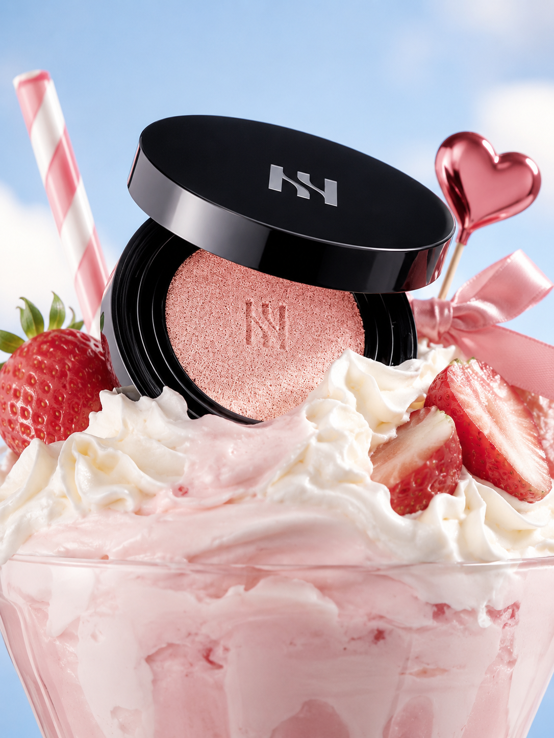
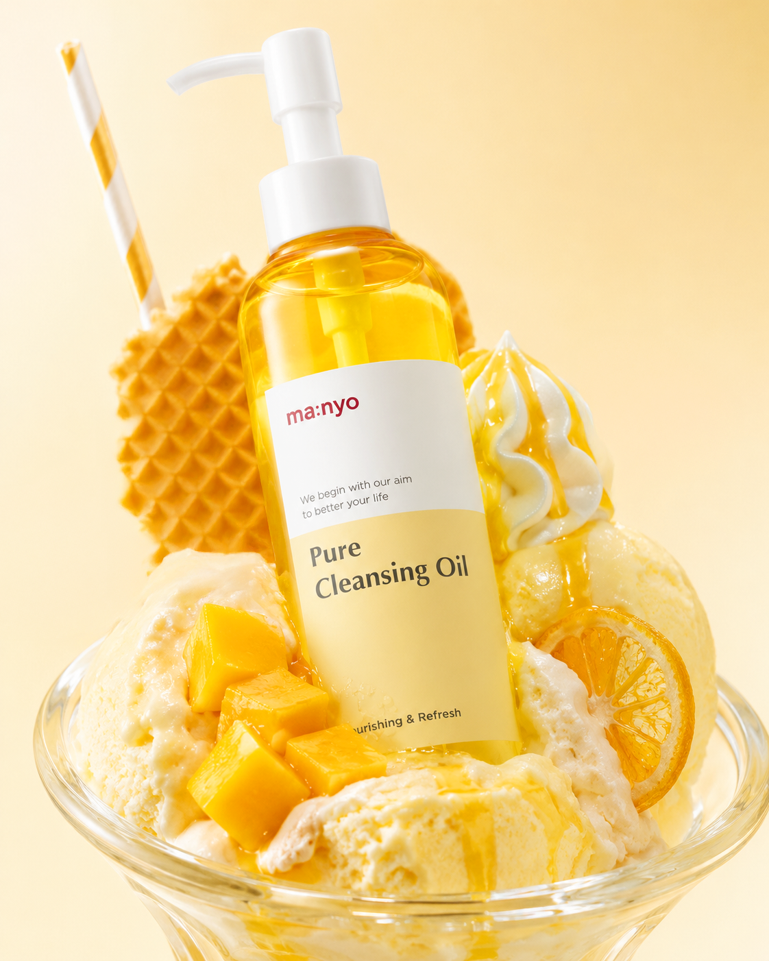
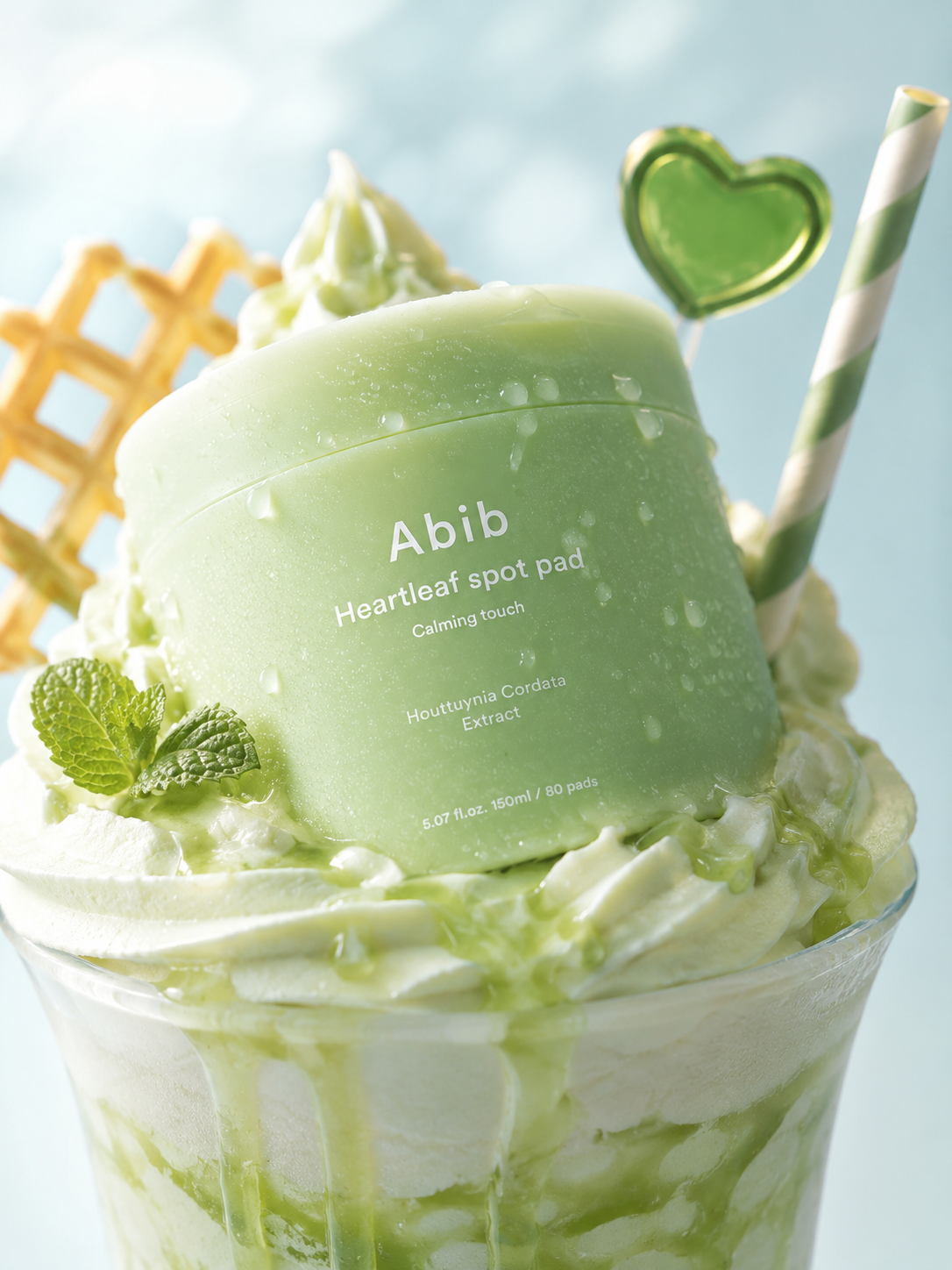
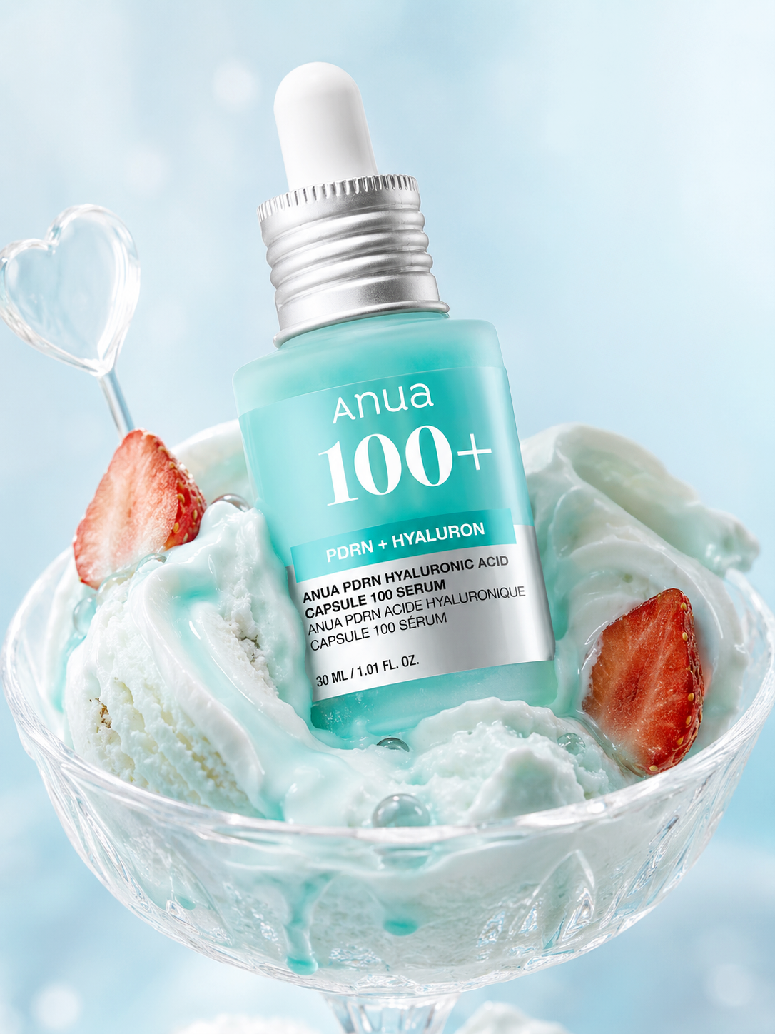
AI 뷰티 연출컷 프롬프트 원문
특정 컬러나 소품을 지정하고 싶다면 첫 번째 문단을 수정하셔도 좋지만,
생성형 AI가 제품에 맞춰 알아서 최적화 하기에 그대로 사용하셔도 무방합니다.
CREATIVE BRIEF
Create a premium beauty campaign image that merges a cosmetic product with an indulgent frozen-dessert world. The final result must feel like a luxury commercial editorial: playful and appetizing, yet polished enough to read as a high-end cosmetic advertisement first. The product is the hero, and the dessert environment exists to dramatize its mood, color identity, and sensorial appeal.
Use the uploaded product as the exact reference. Preserve the original packaging design, logo, label layout, proportions, material finish, and overall silhouette. Keep the branding clearly visible from the front. Do not redesign the bottle, simplify the label, or cover key product information with props, cream, fruit, shadows, or reflections. Do not add any extra text.
VISUAL IDEA
Build a vertical tight close-up composition with a beauty-editorial point of view. The camera should sit slightly below the rim level of the dessert vessel so the product feels large, immersive, and dominant inside the frame. Show the product leaning diagonally and naturally embedded into a rich frozen dessert composition, as if art-directed by a luxury food stylist and beauty photographer together.
The image should communicate a premium dessert fantasy inspired by the product’s visual identity. Translate the product into a frozen dessert story through texture, color, mood, and supporting props. The concept should feel intentional and cohesive rather than decorative or random.
SCENE DESIGN
Place the product inside or against a generous dessert build, with the lower portion physically inserted into the dessert so the cream or ice cream compresses around it convincingly. The product must feel grounded and supported, never floating.
Design the dessert scene using premium frozen elements such as artisanal ice cream, gelato, soft serve, milkshake cream, syrup, or whipped topping—whichever best suits the product’s color system and emotional tone. The dessert should appear rich, creamy, handcrafted, and photogenic, with realistic scoop marks, soft edges, natural gloss, and slight melting where appropriate.
Use a clear dessert glass or another refined serving vessel if it supports the composition, but keep it secondary to the product. The vessel should help frame the composition rather than dominate it.
STYLING LOGIC
Add a restrained selection of styling accents that reinforce the dessert concept without distracting from the product. These may include fruit pieces, a striped straw, syrup drips, waffle textures, cream swirls, thin citrus slices, or other small editorial props that suit the chosen flavor story. Arrange them so they support the product visually and rhythmically, but never obscure the label.
The dessert components must feel handcrafted and indulgent, with believable material behavior: creamy density, subtle gloss, light melting, soft deformation, and realistic contact where the product meets the dessert. Avoid rigid symmetry or fake CGI smoothness.
COLOR AND MOOD
Extract the visual palette from the product and reinterpret it as a refined dessert campaign. Establish one hero tone, one supporting tone, one accent tone, and one soft studio background tone. Apply the palette across the dessert, syrup, vessel, props, reflections, and background so the whole image feels art-directed as one unified campaign.
Keep the background clean and softly atmospheric, using a gentle pastel gradient or luminous studio backdrop. It should separate the product clearly while maintaining a dreamy, fresh, premium mood. The overall emotional impression should feel sweet, glossy, youthful, fresh, and elevated.
LIGHTING AND CAMERA
Use professional commercial beauty lighting with bright, diffused studio illumination, soft shadows, glossy highlights, and refined specular control. The product materials must remain accurate and premium. The dessert textures should look creamy and appetizing, with crisp highlight control and subtle depth.
Photograph the scene like a luxury advertising still using a close-range editorial crop, shallow depth of field, and a medium-format commercial photography feel. Keep the crop tight enough that the product and dessert composition fill the frame with immersive presence.
VISUAL PRIORITY
The cosmetic product must remain the unmistakable hero at first glance. The dessert must function as a sculptural support system that amplifies the product’s personality rather than stealing attention. Use scale, angle, lighting, and contrast to direct the eye toward the product immediately.
QUALITY CONTROL
Ultra-photorealistic. Preserve realistic optical behavior across all materials:
- accurate product packaging and label clarity
- realistic transparency and gloss where applicable
- natural cream texture and melting behavior
- believable fruit moisture and syrup shine
- proper contact shadows and weight
- premium commercial finish
GUARDRAILS
Do not create a generic food photo.
Do not make the dessert overpower the product.
Do not distort the packaging.
Do not hide the logo.
Do not add extra text.
Do not use cluttered props.
Do not use unrealistic colors that fight the product identity.
Do not make the scene childish, messy, or cheap.
The final image should read as a luxury cosmetic campaign with a dessert concept, not as a dessert ad with a cosmetic bottle placed inside.
맺음말
이 프롬프트를 활용하시면, 더 이상 비싼 스튜디오나 소품 세팅 없이도 뷰티 브랜드의 인스타그램 피드나 상세페이지 헤더에 들어갈 만한 멋진 키비주얼(Key Visual)을 뚝딱 만들어내실 수 있을 거예요!
혹시 여러분만의 특별한 응용 방법이 생겼거나, 멋진 결과물이 나왔다면 댓글로 자유롭게 공유해 주세요!
궁금한 점이 있으시다면 언제든 답변해 드리겠습니다. 😊
오늘의 프롬프트가 유용하셨다면, 공감(❤️)과 댓글 부탁드리며, 다음에도 실무에 200% 활용 가능한 꿀팁 프롬프트로 찾아오겠습니다. 감사해요 :)
이 글과 이어지는 내용은 쿠션 파운데이션 AI 이미지 프롬프트, 클리니컬 스킨케어 화보 프롬프트, 태닝코어 이미지 트렌드 분석에 정리했습니다.
하이엔드 화보 톤을 재현하며 찾은 네 가지 기준을 정리했습니다.
'프롬프트 아카이브' 카테고리의 다른 글
| 쿠션 파운데이션 AI 이미지 프롬프트: 제품 구조·로고 보존 방법 (4) | 2026.07.24 |
|---|---|
| 스킨케어 AI 프롬프트 만드는 법: 브랜드 보이스와 고객 세분화 (0) | 2026.07.21 |
| 클리니컬 스킨케어 화보 AI 프롬프트: 유리·금속·제품 보존 설계법 (0) | 2026.07.20 |
| 3D 캐릭터 AI 이미지 (무드보드, 캐릭터 콜라주, Y2K) (0) | 2026.07.19 |
| AI 음식 포스터 프롬프트 작성법: 에디토리얼 디자인 원문 공유 (0) | 2026.07.17 |