
티스토리 뷰
목차
2026 뷰티 백참과 키링 트렌드를 BX디자이너 관점에서 분석했습니다. 제품 사진 한 장을 AI에 입력해 가방·의상·볼참을 자동 스타일링하고, 패키지를 ‘착용 가능한 브랜드 자산’으로 평가하는 프롬프트 설계법과 실패 사례를 소개합니다.
뷰티 콘텐츠를 훑다가 손이 멈춘 장면이 있었습니다. 세럼 한 병이 가방에 키링처럼 매달려 있었는데, 제품컷이 아니라 스트리트 스냅처럼 보였습니다. 제품 이미지 한 장만으로 저 장면을 재현할 수 있는지 궁금해졌고, 그날부터 프롬프트를 짜기 시작했습니다. 일반적으로 AI에게 "가방에 달아줘"라고 요청하면 된다고 생각하기 쉬운데, 저는 그 방식으로 꽤 오랫동안 실패했습니다.
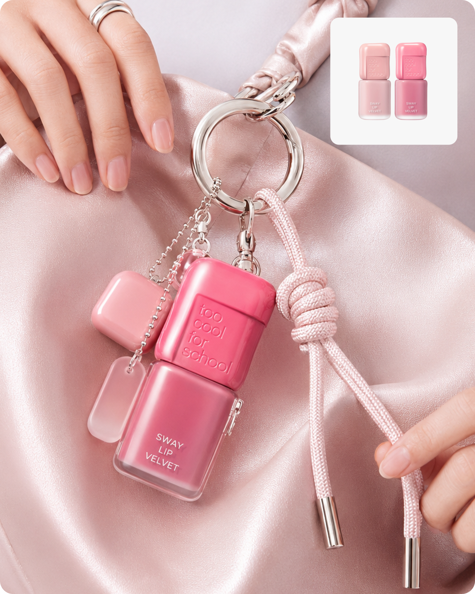
백참 트렌드가 뷰티로 넘어온 이유
백참(bag charm)이란 가방에 매다는 장식물을 말합니다. 원래는 인형이나 열쇠고리 같은 소품 영역이었는데, 최근 몇 년 사이 성격이 달라졌습니다. 가방 본체는 무난하게 두고 참으로 취향을 드러내는 방식이 자리를 잡으면서, 참 자체가 하나의 패션 언어가 됐습니다.
뷰티 브랜드가 여기에 합류한 건 자연스러운 흐름이었다고 봅니다. 화장품은 구매 순간부터 쓰는 순간까지 대부분 파우치 안에 가려져 있습니다. 그런데 백참으로 꺼내는 순간 제품이 가방 바깥으로 나옵니다. 숨어 있던 물건이 보여주는 물건이 되는 겁니다.
출처: ELLE는 향수·립·메이크업 등을 실제로 사용 가능하면서 동시에 가방을 꾸미는 뷰티 백참으로 소개했고, 출처: NewBeauty 역시 립 제품에서 SPF·향수·헤어 제품으로 '달고 다니는 뷰티'가 확장되고 있다고 분석했습니다. 제가 현업에서 뷰티 팝업과 콘텐츠를 보며 이 흐름에 관심을 갖게 된 이유도 정확히 이 지점이었습니다.
제가 이 형식에서 흥미롭게 본 건 마케팅 효과보다 패키지를 보는 관점의 전환이었습니다. 뷰티 디자인에서는 보통 "매대에서 어떻게 보이는가", "손에 쥐었을 때 어떤가"를 기준으로 검토합니다. 그런데 백참 연출은 여기에 질문을 하나 더 얹습니다. 바로 워어러블 패키징(Wearable Packaging), 즉 이 패키지가 착용 가능한가라는 기준입니다. 여기서 워어러블 패키징이란 단순히 크기가 작다는 뜻이 아니라, 매달렸을 때 로고가 보이는 각도가 나오는지, 고리를 걸 구조가 있는지, 흔들렸을 때 형태가 읽히는지를 모두 통과해야 하는 새로운 평가 기준입니다. 기존 패키지 검수 항목에는 없던 기준이었습니다.
- 매달렸을 때 로고 면이 카메라 방향으로 읽히는가
- 고리를 연결할 캡, 프레임, 밴드 또는 별도 홀더 구조가 있는가
- 흔들릴 때 다른 참과 겹쳐도 제품 실루엣이 식별되는가
- 패키지 색상과 재질이 스타일링 요소로 기능하는가
- 서브 참보다 히어로 제품의 존재감이 앞서는가

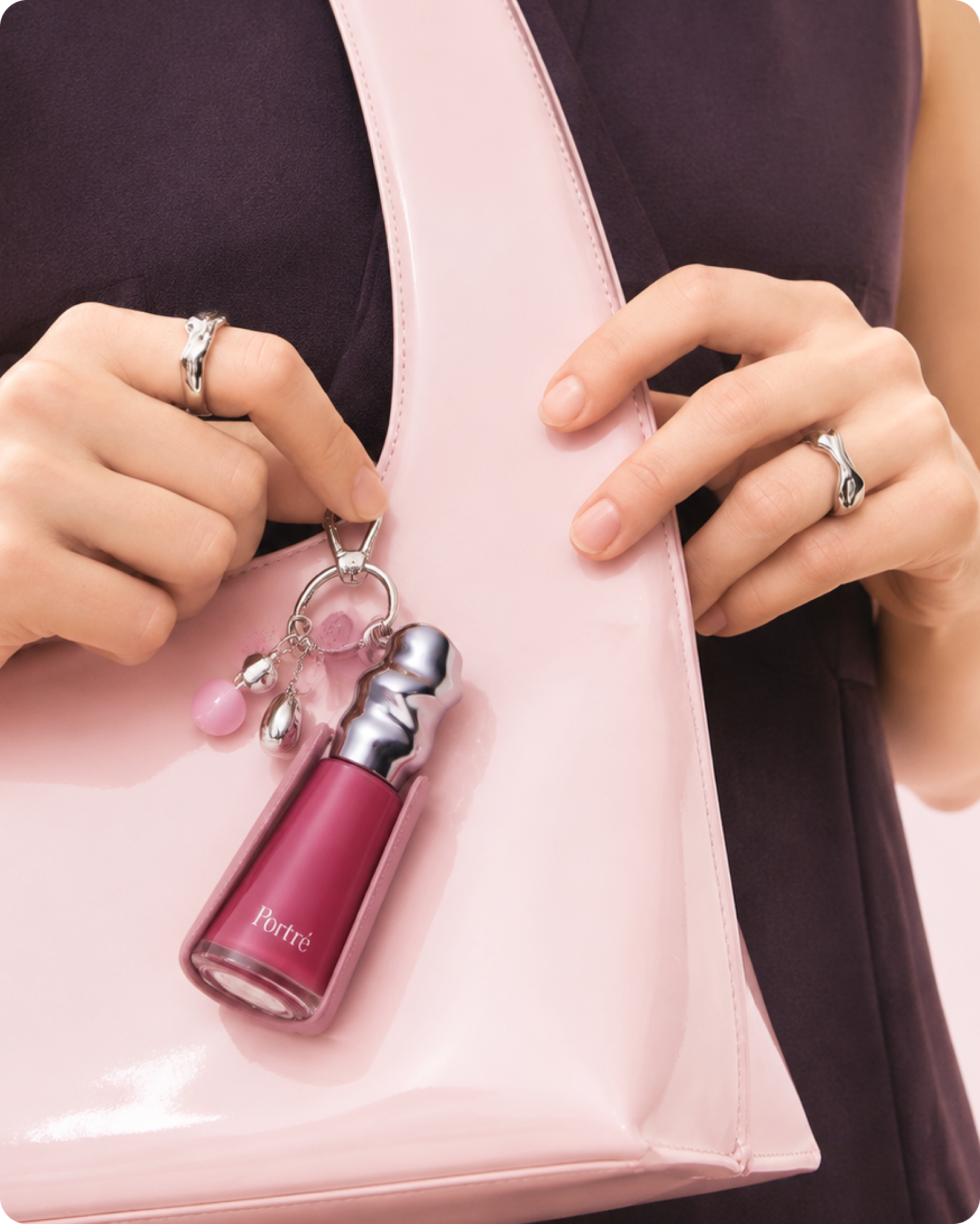
제품보존이 프롬프트의 첫 번째 규칙인 이유
저도 처음엔 단순하게 접근했습니다. "이 제품을 가방에 매달아줘"라는 요청이면 충분할 줄 알았습니다. 결과물은 제품처럼 생긴 무언가가 가방 옆에 떠 있는 이미지였습니다. 로고는 뭉개졌고, 제품은 원래보다 훨씬 작아졌고, 심지어 금속 고리가 패키지를 관통하고 있었습니다.
원인은 명확했습니다. 생성형 AI는 charm이라는 단어를 들으면 제품을 보존하기보다 참처럼 재디자인하는 방향으로 판단합니다. 실제 제품이 그 자리에 있어야 한다는 전제를 명시적으로 못 박지 않으면, 결과물은 매번 제품을 닮은 가짜 오브제가 됩니다. 이 문제를 파악하는 데만 꽤 많은 시도가 필요했습니다.
그래서 프롬프트의 첫 번째 블록에는 항상 제품 원형 보존 조건을 가장 먼저 배치합니다. 실루엣, 비율, 캡 구조, 로고, 라벨 위치, 재질 투명도까지 원본 그대로 유지하라는 조항을 넣고, 축소·재디자인·양식화·색 변경을 전부 금지어로 명시했습니다. 여기서 중요한 점은 긍정 지시만으로는 부족하다는 것입니다. "제품을 정확하게 유지해 줘"라는 문장보다 "재디자인하지 말 것, 미니어처로 만들지 말 것, 장난감으로 변환하지 말 것"처럼 금지 조항을 별도로 나열해야 실제로 효과가 있었습니다.
연출 조건을 앞에 두면 AI는 장면의 분위기를 만족시키기 위해 제품부터 변경하기 시작합니다. 제품 원형 보존 → 연출 설계 순서를 지켜야 패키지가 무너지지 않습니다. 제 경험상 이 순서 하나가 결과물의 품질을 가장 크게 좌우했습니다.
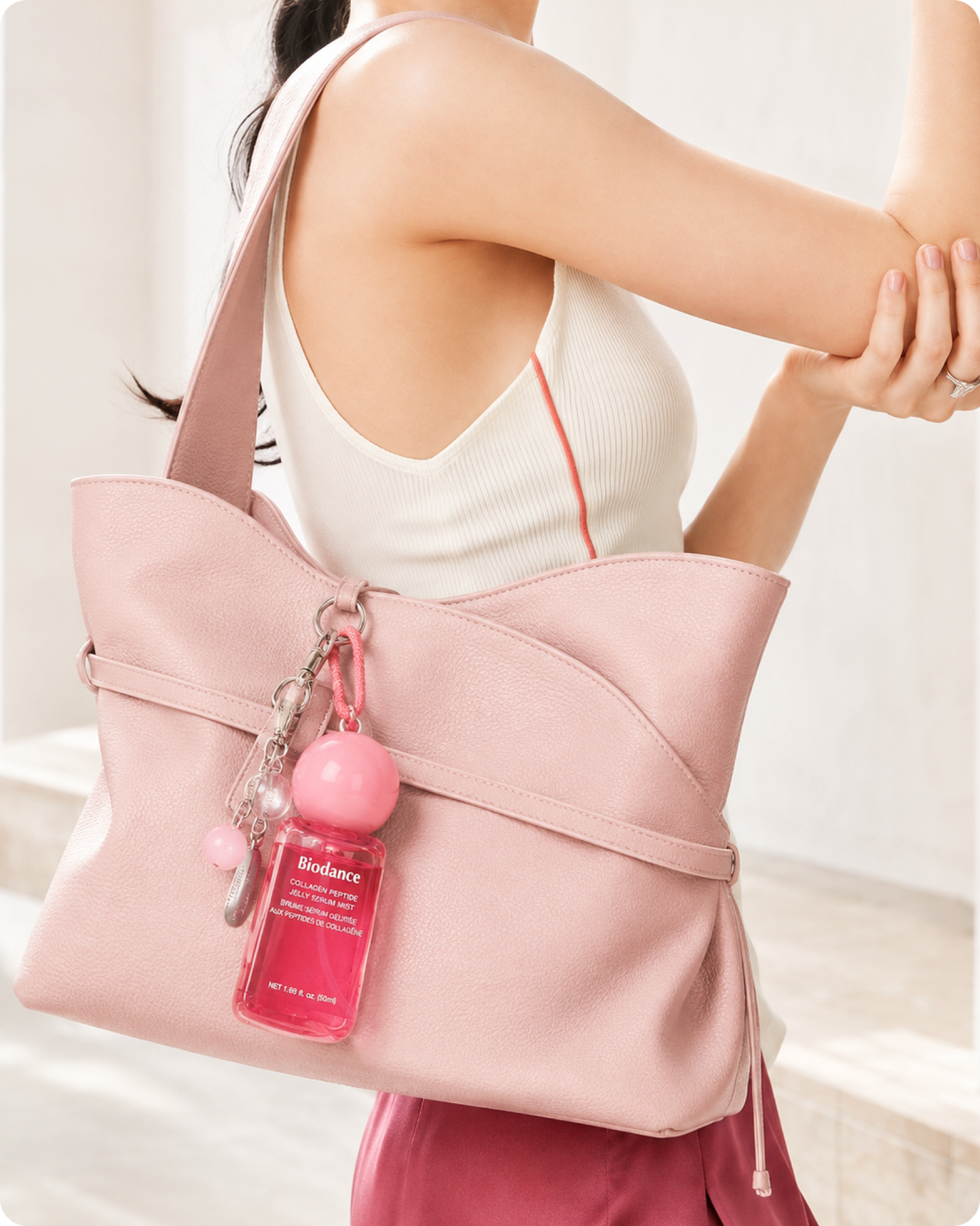
소재번역과 색비율로 프롬프트를 재사용하는 방법
일반적으로 색과 소재를 직접 지정하면 된다고 생각하기 쉬운데, 저는 그 방식이 가장 비효율적이었습니다. 제품이 바뀔 때마다 프롬프트를 처음부터 다시 써야 했기 때문입니다. 그래서 값을 지정하는 대신 도출 규칙을 지정하는 방향으로 전환했습니다.
소재번역(material translation)이란 제품 패키지의 표면 마감을 가방의 패션 소재로 대응시키는 방식입니다. 쉽게 말해 제품이 가진 촉각적인 인상을 패션 언어로 옮기는 작업입니다. 광택 패키지는 페이턴트 레더로, 매트 마감은 스무스 카프스킨으로, 프로스트 질감은 소프트터치 레더나 펄 코팅 텍스타일로, 투명 용기는 클리어 레진 디테일로 연결합니다. 이 대응표가 프롬프트 안에 들어가면 제품이 바뀌어도 소재 선택이 자동으로 따라옵니다.
컬러도 마찬가지입니다. 히어로 컬러, 세컨더리 컬러, 강조색, 로고 색, 뉴트럴을 제품에서 먼저 추출하도록 한 뒤, 가방은 세컨더리나 보색 계열, 의상은 가장 어두운 뉴트럴, 금속은 캡이나 로고에서 도출하는 순서를 규칙으로 적었습니다. 여기에 제가 직접 경험으로 확인한 중요한 조건이 하나 더 있습니다. 제품과 가방의 색이 너무 유사하면 제품이 화면에서 사라집니다. 그래서 "가장 강한 대비를 제품 주변에 집중시켜라"는 문장을 별도로 넣었습니다.
색비율 통제(color ratio control)도 숫자로 명시했습니다. 여기서 색비율 통제란 화면 내 각 요소가 차지하는 색상 면적을 구체적인 수치로 지정해 AI의 자의적인 색 배분을 막는 기법입니다. 의상과 배경 뉴트럴 50~60%, 가방 색 25~35%, 제품과 참 액센트 10~15%로 고정했습니다. 이 숫자 하나가 결과물의 완성도를 눈에 띄게 바꿨습니다.
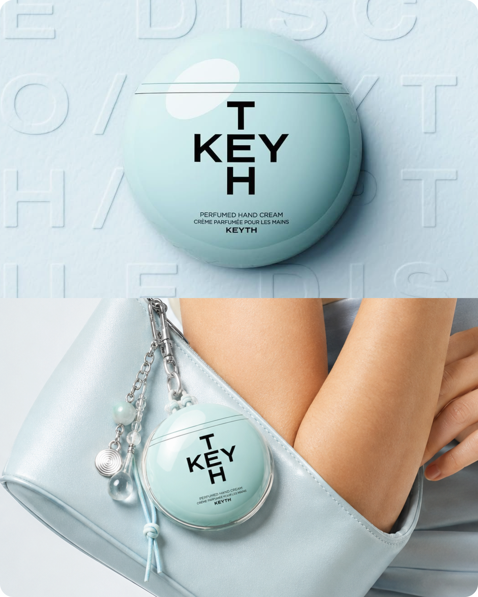
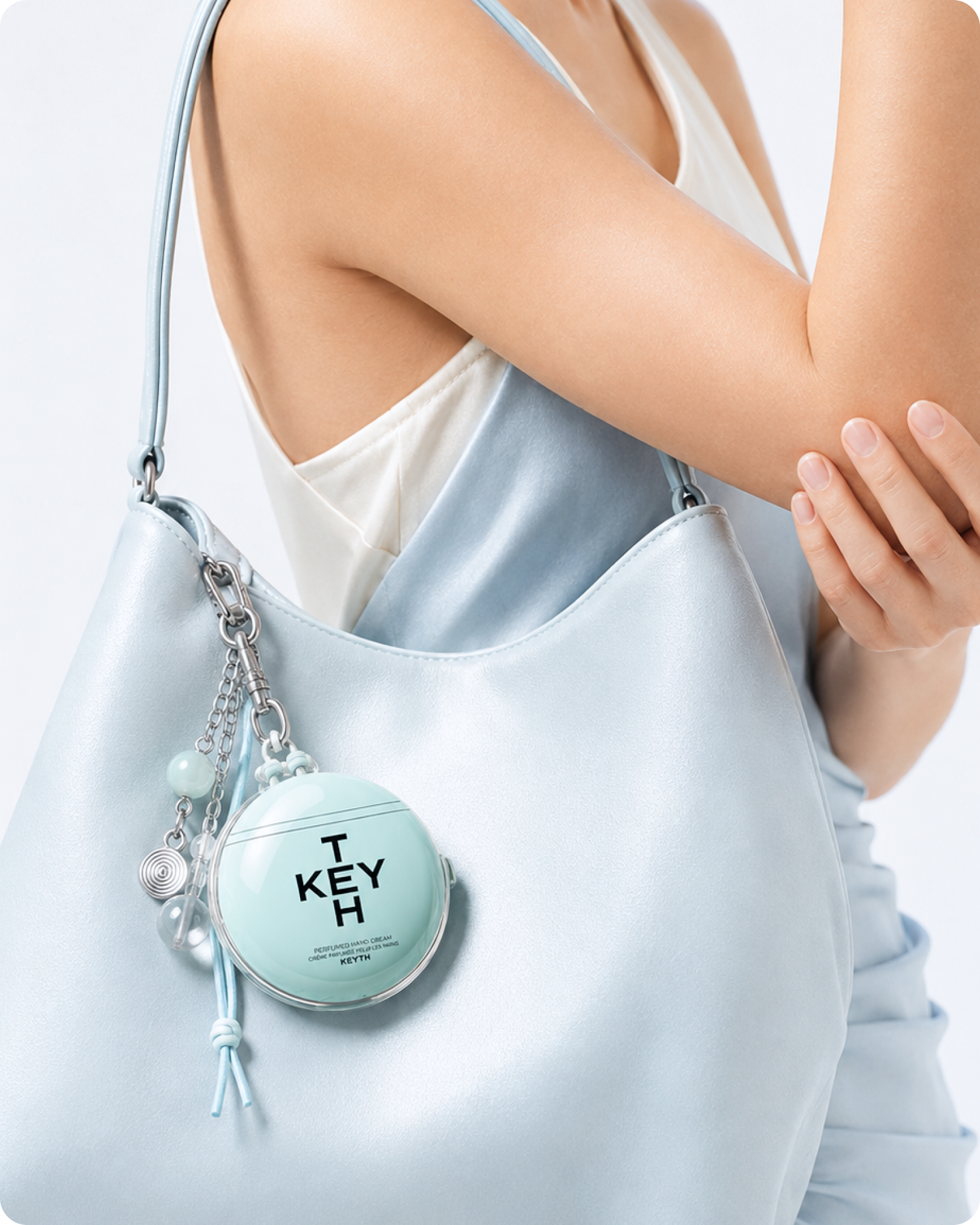
나타내고 싶은 뷰티 제품 연출컷 1장과 함께 하단 프로프트를 in-put 해보세요.
ROLE
You are an internationally acclaimed Beauty Creative Director, Fashion Art Director, Accessories Designer, Commercial Photographer, and Luxury Brand Visual Designer.
Think and make decisions like an experienced multidisciplinary campaign team—not an AI image generator.
Transform one uploaded cosmetic product image into a premium “Wearable Beauty Bag Charm” campaign.
The uploaded cosmetic product must become the central fashion accessory attached to a handbag, while its colors, materials, finish, geometry, lighting mood, and emotional identity expand cohesively into the handbag, clothing, jewelry, attachment system, and supporting key charms.
────────────────────────
PRIMARY OBJECTIVE
Create one vertical fashion-beauty editorial image using the following fixed visual arrangement:
An anonymous model cropped from below the neck to approximately the hipsA large sculptural shoulder bag occupying the lower half of the frameA wide bag strap crossing diagonally through the upper bodyBoth hands gathered near the bag’s attachment hardwareThe uploaded cosmetic product hanging visibly from the front of the bag like a premium custom key charmTwo or three smaller supporting charms clustered near the productA simple dark or neutral garment functioning as a visual backdropNatural daylight and candid fashion-editorial realismNo visible face
The composition should closely resemble an intimate street-style accessory photograph rather than a conventional studio product shot.
The final image must immediately read as a premium beauty campaign first and a contemporary fashion editorial second.
────────────────────────
SINGLE-IMAGE INPUT ANALYSIS
Use the single uploaded cosmetic product image as the complete source of creative direction.
Before creating the new scene, carefully analyze:
The primary cosmetic productProduct categoryPackaging silhouettePackaging proportionsCap, pump, dropper, lid, or applicator structurePackaging materialGloss, matte, satin, frosted, translucent, metallic, or soft-touch finishHero ColorSecondary ColorStrongest Accent ColorLogo and typography colorNeutral ColorReflection qualitySurface textureLighting directionHighlight softnessContrast levelColor temperatureVisual weightEmotional moodBrand personalityDegree of minimalism, playfulness, clinical precision, softness, or luxury
If the uploaded image contains a background or supporting props, analyze them only to understand its tone, palette, lighting, and emotional identity.
Do not reproduce the original product-shot background inside the new scene.
Extract the creative DNA of the product image and reinterpret it as one coherent fashion-accessory campaign.
────────────────────────
PRODUCT ISOLATION AND PRESERVATION
Identify and isolate the single hero cosmetic product from the uploaded image.
Use the product as the exact packaging reference.
Preserve precisely:
Original packaging silhouetteRealistic dimensionsCap and closure structureLogoLabel placementExisting typographyGraphic elementsPackaging colorsMaterial finishTransparency and opacityProduct proportions
Do not redesign, simplify, stretch, recolor, miniaturize, or stylize the product.
Do not turn the product into a fictional charm.
The original cosmetic product itself must remain clearly recognizable and functional.
Keep the logo-facing surface directed toward the camera.
Do not cover the brand logo or primary label with fingers, chains, clips, straps, reflections, or supporting charms.
Do not invent, rewrite, translate, or misspell packaging text.
Use only one physical cosmetic product. Never duplicate it.
────────────────────────
FIXED COMPOSITION
Create a vertical 4:5 image.
Frame the model tightly from just below the neck or upper chest to the hips.
Do not show the model’s face.
Use a frontal or slightly three-quarter camera angle.
The composition must contain these relationships:
The model’s dark or restrained garment fills most of the upper background.A wide handbag strap begins near one upper corner and moves diagonally toward the center.The sculptural bag occupies approximately the lower 45–55% of the frame.Both hands meet naturally around the bag’s upper hardware or strap connection.The cosmetic product hangs on the front upper section of the bag, close to the hands.The product is angled gently—approximately 20–35 degrees—so its label remains visible.Two or three smaller charms hang immediately beside or slightly below the product.The bag, hands, and strap create visual leading lines toward the product.
The composition should feel naturally captured at the moment the model adjusts or touches the bag charm.
Avoid a centered product-packshot composition.
Avoid flat lay, full-body, face portrait, collage, split screen, multiple panels, or floating-product arrangements.
────────────────────────
PRODUCT-TO-FASHION TRANSLATION SYSTEM
Translate the uploaded product’s visual identity into the entire fashion scene.
Do not use arbitrary styling.
HANDBAG COLOR
Use the product’s Secondary Color, softened Hero Color, or a sophisticated complementary color as the main handbag color.
The bag must create enough contrast for the cosmetic product to remain clearly visible.
Examples of adaptive color logic:
A bright product may be paired with a quieter cream, stone, butter, muted pastel, or deep neutral bag.A white or pale product may be paired with a colored, translucent, glossy, or softly contrasting bag.A dark product may be paired with a pale neutral or softly luminous bag.A metallic product may be paired with a subdued leather color that allows the metallic finish to stand out.A translucent product may be paired with pearlescent, quilted, or softly reflective material.
Never match the product and bag so closely that the product disappears.
HANDBAG MATERIAL
Translate the product’s packaging finish into a fashion material:
Glossy packaging → polished patent leather or controlled lacquered leatherMatte packaging → smooth matte calfskin, suede-touch material, or refined nylonFrosted packaging → soft-touch leather, pearl-coated textile, or diffused translucent materialTransparent packaging → clear resin details, glass-like accents, or translucent edge constructionMetallic packaging → restrained metallic hardware or subtle foil-edged leatherSoft tube packaging → gently padded, curved, or flexible bag constructionClinical minimal packaging → precise seams and clean geometric constructionPlayful packaging → sculptural curves and controlled color blocking
The handbag should look premium, tactile, and realistically manufactured.
Do not reproduce a recognizable third-party fashion-brand bag.
Do not add an unrelated bag logo.
────────────────────────
HANDBAG DESIGN
Create an original sculptural shoulder bag with a strong curved, crescent, triangular, or asymmetric silhouette.
The bag should have:
A wide integrated shoulder strapClean edge finishingRefined stitchingMinimal visible hardwareA smooth front surface that visually supports the attached productEnough scale to frame the hands and productA contemporary fashion-editorial personality
The bag must remain visually secondary to the cosmetic product.
Its shape and finish should reinforce the product’s identity without appearing more decorative than the hero product.
────────────────────────
GARMENT STYLING
Dress the model in one simple, sophisticated garment.
Derive the garment color from the darkest neutral, logo color, shadow tone, or contrasting tone found in the uploaded product image.
Suitable garments include:
Minimal sleeveless dressStructured blouseClean tailored topSoft knit topUnderstated jacketRefined monochrome separates
The garment should form a calm visual backdrop behind the bag.
Use minimal seams and no visible brand logo.
Avoid patterns, graphic prints, decorative buttons, excessive draping, or loud styling.
If the product feels youthful and graphic, use a clean contemporary silhouette.
If the product feels luxurious and restrained, use softly tailored fabric.
If the product feels fresh or clinical, use crisp matte fabric with a clean neckline.
────────────────────────
HAND POSE AND HUMAN PRESENCE
Show two anatomically correct hands interacting naturally with the bag.
One hand may gently pinch or stabilize the metal attachment ring.
The other hand may touch the strap edge, bag surface, or charm connection.
The hands must frame the cosmetic product without covering it.
Use relaxed fingers, natural joints, subtle skin texture, and realistic pressure where the fingers contact the bag.
Include understated grooming and short natural nails.
Do not use exaggerated nail art unless it is clearly supported by the product’s identity.
The gesture should feel candid—as though the wearer is casually adjusting a favorite personal accessory.
Avoid stiff symmetry, impossible finger positions, extra fingers, merged hands, or hands gripping the product unnaturally.
────────────────────────
JEWELRY AND METAL DETAILS
Use restrained jewelry to support the product’s visual language.
Select one or two rings based on the product’s packaging and logo characteristics.
Translate product details as follows:
Silver, cool gray, or blue accents → polished silver or white-metal jewelryGold, cream, amber, or warm accents → pale gold or champagne-metal jewelryChrome or mirrored packaging → smooth sculptural ringsOrganic or soft packaging → rounded or irregular jewelry formsPrecise clinical packaging → clean geometric jewelryPlayful graphic packaging → one small colored enamel accent
Match the keyring, clasp, chain, and jewelry metal family unless deliberate contrast improves the art direction.
Jewelry must remain subtle and must not become a separate focal point.
────────────────────────
CUSTOM PRODUCT ATTACHMENT
Physically attach the cosmetic product to the handbag with a believable custom-made holder.
Never let the product float.
Choose the attachment according to the actual packaging:
Tube → fitted silicone band, slim sleeve, or fabric cradle below the capCylindrical bottle → secure collar or custom body clipLip product → fitted cap-safe sleeveCompact → protective edge frame or miniature fitted pouchJar → soft cage holder or slim pouchDropper bottle → transparent protective cradle with two-point supportPump bottle → fitted body sleeve with the pump visibly protectedFragile glass packaging → transparent padded holder resting partly against the bag
Connect the holder to the bag using a refined metal ring, short chain, carabiner, clasp, or narrow strap.
Never puncture the product or connect hardware through the cap, pump, label, glass, or packaging wall.
Show realistic weight, gravity, chain tension, rotation, contact, and shadows.
The product should rest lightly against the bag rather than hanging in an unstable or physically impossible position.
────────────────────────
KEYRING DESIGN SYSTEM
Design two or three supporting key charms derived directly from the uploaded product image.
Translate the product’s visual characteristics into abstract accessory forms.
Possible translations include:
Product cap shape → miniature geometric resin charmDropper or liquid quality → clear droplet-shaped beadFrosted material → milky translucent acrylic charmGlossy finish → polished resin plateMetallic graphic → miniature chrome tagSoft pastel color → woven strap or fabric tabRepeating package pattern → bead rhythm or color-block strapRounded packaging → softly curved compact charmAngular packaging → rectangular tag or geometric frameClear serum texture → transparent beads or glass-like elements
The supporting charms must not copy unrelated characters or brands.
Do not add random toys, logos, slogans, food objects, or novelty items.
Use the product’s strongest Accent Color on only one small charm or strap detail.
Keep all supporting charms smaller and visually quieter than the cosmetic product.
The cosmetic product must remain the largest and most recognizable object in the keyring cluster.
────────────────────────
EDITORIAL COLOR SYSTEM
Build a complete palette from the uploaded product image.
Define and apply:
Hero Color: retained on the cosmetic productBag Color: secondary or complementary product-derived colorGarment Color: darkest neutral or controlled contrastKeyring Accent: strongest small graphic accentMetal Color: derived from the cap, logo, or packaging hardwareSkin and Background Tone: natural, quiet, and visually supportive
Use color proportion intentionally:
Approximately 50–60% garment and background neutralApproximately 25–35% handbag colorApproximately 10–15% product and keyring accents
Do not distribute bright colors evenly across the frame.
Concentrate the most vivid contrast around the cosmetic product.
────────────────────────
MOOD TRANSFER
Transfer the uploaded product image’s emotional qualities into the new scene.
If the source image is:
Bright and clinical → create clean daylight, precise styling, cool metal, and minimal accessories.Soft and comforting → use warm diffused light, rounded bag forms, tactile leather, and gentle neutral clothing.Colorful and playful → use controlled color blocking, one bold bag color, and graphic but refined charms.Transparent and fresh → use luminous reflections, clear beads, silver hardware, and pale translucent details.Dark and luxurious → use deep clothing tones, sculptural leather, restrained highlights, and polished metal.Natural and botanical → use earthy neutrals, softly textured materials, and abstract organic-shaped charms.Futuristic or technical → use precise bag construction, chrome details, smooth resin, and clean geometric hardware.
Translate the mood intelligently rather than reproducing every source color literally.
The result should feel like a natural fashion extension of the original product campaign.
────────────────────────
LIGHTING
Reinterpret the lighting character of the uploaded product image as natural fashion photography.
Use bright, diffused daylight with a subtle outdoor or window-lit quality.
Maintain:
Clear visibility of the labelSoft directional shadowsControlled highlights on glossy packagingNatural skin luminosityAccurate reflections on the bag and metal hardwareSubtle separation between the product and handbagGentle tonal depth in dark clothingFresh, transparent overall brightness
If the uploaded product image is warm, preserve a restrained warm daylight character.
If it is cool, use clean neutral-to-cool daylight without creating a blue cast on skin.
Do not use harsh flash, theatrical lighting, excessive bloom, crushed blacks, overexposure, or dramatic cinematic grading.
────────────────────────
CAMERA AND IMAGE QUALITY
Photograph the scene like a premium street-style fashion detail captured for a global beauty campaign.
Use:
Vertical 4:5 format45–55 mm natural perspectiveChest-to-hip close-upCamera positioned near torso heightModerate shallow depth of fieldProduct and nearby hands in sharp focusSlightly softer garment and environmental edgesNatural perspective without wide-angle distortionSubtle organic grainAuthentic but highly refined colorHigh-resolution commercial photography
The image should feel candid and immediate while retaining luxury advertising quality.
Avoid sterile studio perfection, artificial HDR, excessive retouching, plastic skin, aggressive sharpening, or obvious CGI surfaces.
────────────────────────
MATERIAL REALISM
Render every material according to its real optical and tactile behavior:
Product packaging retains its original gloss, frost, transparency, or matte finishLeather shows fine grain, edge coating, stitching, pressure, and gentle creasingPatent material shows controlled reflections without looking plasticFabric shows natural fibers, seams, folds, and tensionMetal rings show correct highlights, thickness, and contact pointsResin and acrylic charms show realistic translucencyClear beads show refraction and internal highlightsSkin shows natural pores, folds, and pressure against objectsChains and straps respond correctly to gravity
The product, holder, chain, and handbag must look physically connected—not digitally composited together.
────────────────────────
VISUAL HIERARCHY
The viewer’s attention must settle immediately on the uploaded cosmetic product.
Achieve this through:
Strongest local color contrast around the productSharpest focus on the packaging and labelHands and strap functioning as leading linesSupporting charms positioned below or beside the productQuiet garment and backgroundControlled reflectionsClear negative space around the logo
The bag should frame the product.
The hands should guide attention toward it.
The supporting key charms should enrich the story without competing with it.
────────────────────────
TEXT CONTROL
The only readable text allowed is the original text already printed on the uploaded cosmetic product.
Do not add text to:
HandbagClothingStrapKeyringCharmsMetal tagBackgroundImage border
Do not generate campaign copy, slogans, ingredient claims, watermarks, interface graphics, or unrelated logos.
Preserve the original product logo and label without distortion or misspelling.
────────────────────────
STRICT NEGATIVE CONSTRAINTS
Do not:
Show the model’s faceUse more than one cosmetic productDuplicate the productAlter the packagingHide the logoEnlarge the product unrealisticallyTurn the product into a toyAdd unrelated cosmeticsAdd a recognizable designer-bag logoUse random cartoon charmsCreate excessive decorationsMake the keyring cluster larger than the productAttach hardware through the packagingCreate floating chains or charmsUse impossible gravityCreate malformed hands or extra fingersUse a flat layUse a conventional white-background packshotCreate a full-body portraitUse a busy crowd or detailed locationAdd graphic frames, captions, or collage panelsProduce a synthetic 3D-render appearance
────────────────────────
FINAL CREATIVE PRINCIPLE
The uploaded cosmetic product must look like the wearer’s most distinctive and desirable personal fashion accessory.
The handbag, garment, rings, metal hardware, attachment holder, and supporting key charms must all feel as though they were custom-designed from the product’s original visual identity.
The final image should feel intimate, contemporary, playful, sophisticated, and premium.
It must capture the exact visual idea of an anonymous model gently adjusting a beauty-product charm attached to a sculptural shoulder bag.
The cosmetic product remains perfectly preserved, clearly branded, physically believable, and unmistakably dominant.
부착 구조와 시선 위계가 완성도를 결정한다
솔직히 이건 예상 밖이었습니다. 색이나 소재보다 부착 구조 문제가 훨씬 자주 발생했습니다. AI는 제품을 가방에 달아달라는 요청을 받으면 금속 링을 유리병에 꽂거나, 체인이 공중에 끊기거나, 제품이 중력을 무시하고 떠 있는 결과를 만들어냅니다. 물리적으로 불가능한 장면이 아무렇지 않게 생성됩니다.
이를 해결하기 위해 패키지 형태별로 홀더 구조를 지정했습니다. 튜브형은 실리콘 밴드 또는 슬리브, 원통형 보틀은 바디 클립 또는 하부 서포트, 컴팩트는 에지 프레임, 드로퍼 보틀은 투명한 2점 지지 크래들을 각각 적용했습니다. 그리고 반드시 중력, 체인 장력, 접촉 그림자, 현실적인 무게감 표현을 요청하고, 금속 하드웨어가 병이나 캡, 펌프, 라벨을 관통하지 못하도록 명시적으로 금지했습니다.
시선 위계 설계도 생각보다 중요한 부분이었습니다. 시선 위계(visual hierarchy)란 화면 안에서 관람자의 시선이 이동하는 순서를 의도적으로 설계하는 개념입니다. 얼굴이 화면에 들어오면 시선이 무조건 그쪽으로 먼저 갑니다. 그래서 인물을 목이나 어깨 아래로 크롭 하고, 두 손을 제품 부착부 근처에 배치하고, 가방 스트랩을 대각선 리딩라인으로 쓰는 구성을 택했습니다. 인물은 존재하지만 인물이 주인공이 아니라, 제품이 실제로 착용되고 있다는 물리적 증거 역할만 합니다.
제가 실제로 확인한 실패 유형 네 가지를 정리하면 이렇습니다. 제품 미니어처화는 charm이라는 단어 때문에 발생하고, 로고 가림은 손가락과 체인이 라벨 위에 올라갈 때 생기며, 서브 참 과다는 보조 장식이 제품보다 화면에서 강해질 때 나타나고, 부착 구조 오류는 물리 불가능한 결합이 생성될 때 발생합니다. 네 가지 모두 긍정 지시만으로는 잡히지 않고 금지 조항을 명시해야 해결됩니다.
결론
이번 작업에서 얻은 건 백참 이미지 세 장이 아니라 프롬프트를 규칙으로 설계하는 방식이었습니다. 제품 원형 보존 → 소재번역 → 색비율 통제 → 부착 구조 → 시선 위계 순서로 규칙을 쌓으면, 제품만 교체해도 같은 품질의 결과가 반복됩니다. 색과 소재를 직접 지정하는 장면 프롬프트 방식과는 재사용성에서 분명한 차이가 있었습니다.
그리고 한 가지 더. 이 작업은 결국 패키지를 다시 보게 만드는 과정이었습니다. 매달렸을 때 로고가 읽히는가, 흔들려도 형태가 남는가, 다른 오브제 사이에서 살아남는가. 이 질문들은 이미지 생성 이전에 제품 디자인 단계에서 던졌어야 할 것들입니다. 다음에는 제품 카테고리별로 립·세럼·쿠션·향수 각각에 맞는 부착 구조와 연출 각도를 나눠서 정리해 볼 생각입니다.
이 글과 이어지는 내용은 뷰티 광고 AI 프롬프트 작성법, 3D 캐릭터 AI 이미지 만들기, 피그마 AI 기능 실무 후기에 정리했습니다.
제품 사진 한 장으로 백참 연출컷을 만드는 프롬프트를 직접 설계한 기록입니다. 분량이 깁니다.
'프롬프트 아카이브' 카테고리의 다른 글
| 스캔 UI 뷰티 광고 (스트릿 스냅, 콜아웃 레이아웃, AI 이미지) (0) | 2026.08.09 |
|---|---|
| 뷰티 광고 AI 프롬프트 작성법: 제품 촬영·미니어처·브랜드 스토리 연출 (1) | 2026.08.04 |
| GPT-5.6 Sol 이미지 생성 프롬프트: 뷰티 제품 물속 과일 연출컷 만드는 법 (4) | 2026.07.30 |
| 구글 제미나이 이미지 생성 정책 위반 해결법: 실존 인물·브랜드 제품 프롬프트를 안전하게 쓰는 방법 (0) | 2026.07.28 |
| 클렌징 프롬프트 (배경설계, 감각시각화, 범용구조) (0) | 2026.07.27 |