
티스토리 뷰
목차
GPT 이미지 생성 프롬프트 실험을 통해 뷰티 제품 1컷만으로 물속 과일 연출컷을 만드는 방법을 정리했습니다. GPT-5.6 Sol과 이전 모델의 결과 차이, 제품 색상에 따라 과일이 자동으로 바뀌는 프롬프트 구조를 BX디자이너 관점에서 분석했습니다.
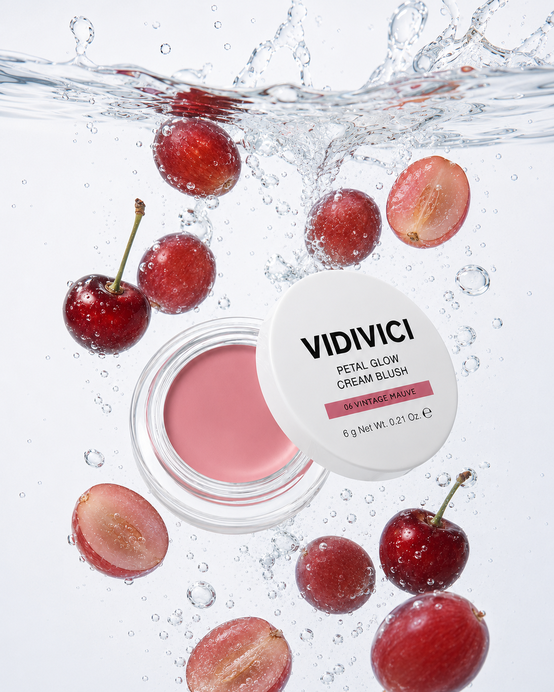
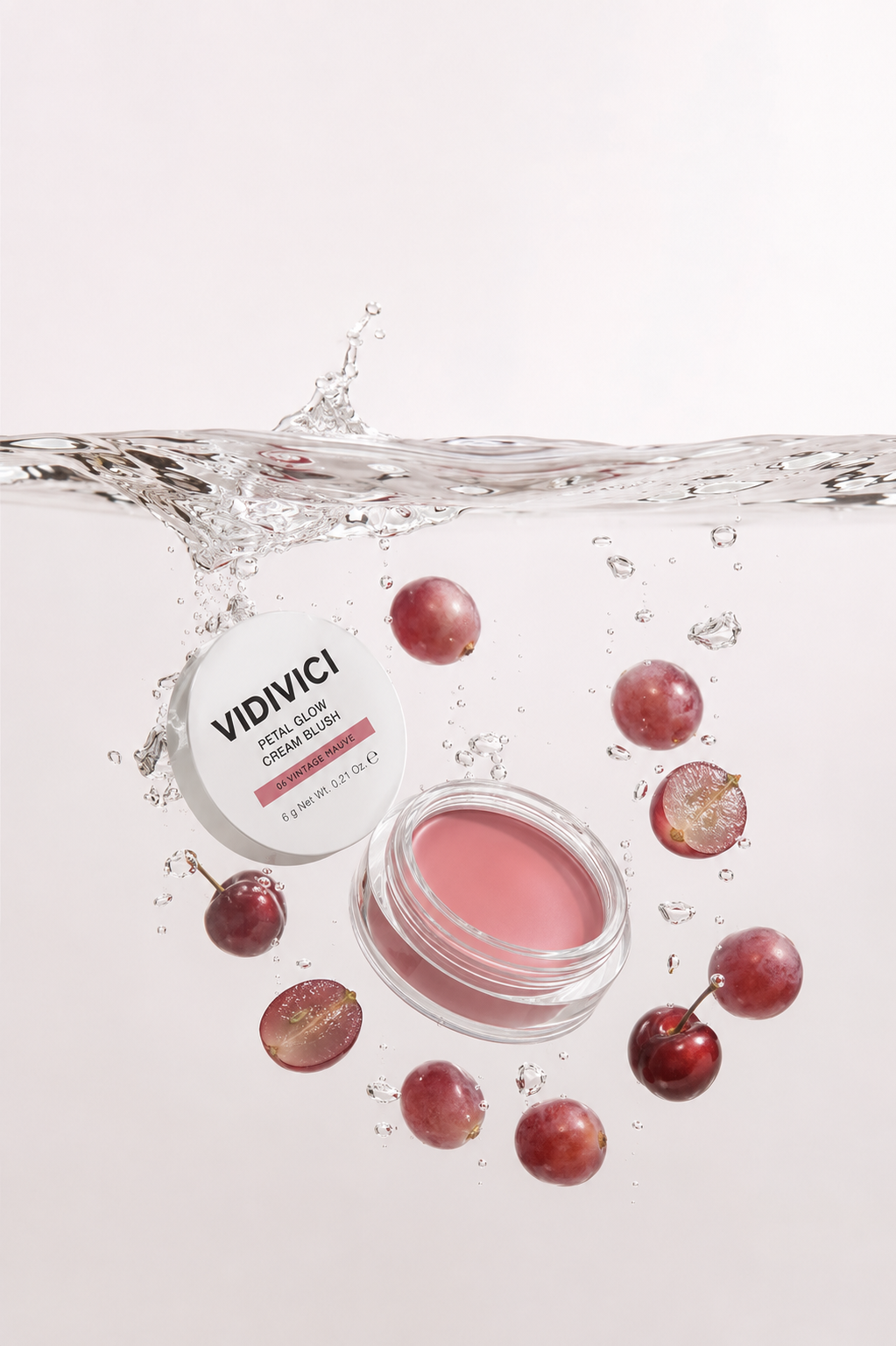
프롬프트만 잘 쓰면 어떤 모델에서도 같은 결과가 나온다고 생각하시는 분들이 많습니다. 저도 그렇게 믿었습니다. 그런데 회사에서 뷰티 블러셔 제품 1컷으로 물속 과일 연출 이미지를 만들어보면서 그 믿음이 완전히 바뀌었습니다. 같은 문장을 넣었는데 모델에 따라 결과가 눈에 띄게 달랐습니다.
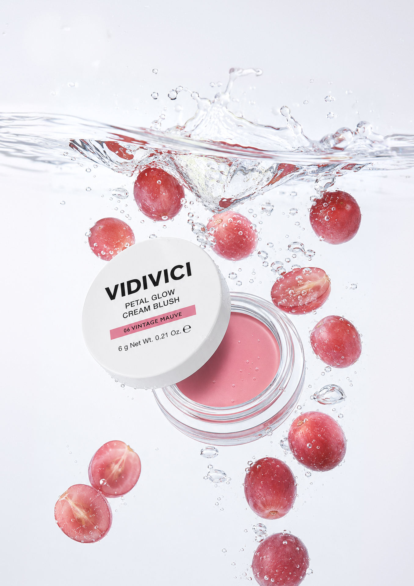
물속 과일 연출, 제품 1컷으로 어디까지 가능한가
제가 처음 이 작업을 시도했을 때는 솔직히 기대가 낮았습니다. 뷰티 제품 연출컷은 보통 열린 제품, 닫힌 제품, 제형 클로즈업, 로고 컷 등 여러 이미지를 함께 넣어야 안정적인 결과가 나온다고 알려져 있습니다. 그런데 이번에는 일부러 블러셔 제품 사진 1장만 첨부해 봤습니다.
결과는 예상보다 훨씬 구체적이었습니다. AI가 패키지 구조, 즉 뚜껑과 하단 용기의 형태, 힌지(hinge)의 방향까지 읽어냈습니다. 여기서 힌지란 쿠션이나 블러셔처럼 뚜껑이 열리는 화장품에서 뚜껑과 본체를 연결하는 경첩 구조를 말합니다. 이 디테일이 흐트러지면 제품이 전혀 다른 물건처럼 보이기 때문에, 뷰티 연출컷에서는 힌지 보존이 매우 중요한 요소입니다.
더 흥미로웠던 부분은 과일 선택이었습니다. 저는 프롬프트 안에 과일 이름을 직접 쓰지 않았습니다. 대신 "업로드한 제품의 컬러와 제형을 분석해 어울리는 과일을 자동으로 선택하라"는 지시만 넣었습니다. 그랬더니 핑크 계열 블러셔에는 복숭아와 자몽처럼 부드러운 색감의 과일이, 오렌지 계열 제품에는 귤과 오렌지 슬라이스처럼 상큼한 요소가 배치되었습니다.
이것은 단순한 장식이 아닙니다. 뷰티 콘텐츠에서 과일은 제품 컬러를 직관적으로 전달하는 시각적 번역 장치 역할을 합니다. "코랄빛 블러셔"라는 설명보다, 물속에 떠 있는 오렌지 조각 하나가 제품의 분위기를 훨씬 빠르게 전달합니다. 또한 물, 과일, 투명 버블의 조합은 제형의 촉촉함과 맑은 발색을 시각화하기에도 효과적입니다.
프롬프트 구조는 크게 여섯 갈래로 나눠 설계했습니다.
- 제품 보존 조건: 형태, 로고, 컬러, 힌지, 패키지 구조 원본 유지
- 장면 조건: 제품이 물에 막 진입한 순간처럼 연출
- 물리감 조건: 부력(buoyancy), 물방울, 버블, 수면 반사를 자연스럽게 표현. 부력이란 물속에 잠긴 물체가 위로 뜨려는 힘을 말하며, 이 표현이 살아야 제품이 물속에 자연스럽게 떠 있는 것처럼 보입니다
- 과일 자동 선택 조건: 제품 컬러와 제형 분석 기반으로 AI가 직접 결정
- 광고 이미지 조건: 하이엔드 뷰티 캠페인 구도, 제품이 과일보다 우선 노출
- 금지 조건: 과일 과다 배치, 로고 왜곡, 제품 형태 변형, 불필요한 인물 요소 차단
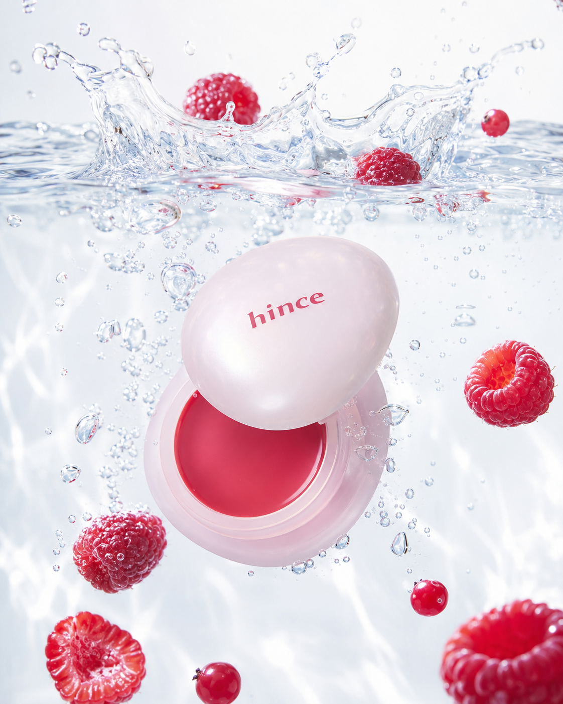
이 구조를 적용하니 같은 프롬프트로 핑크, 코랄, 베리 계열 제품을 각각 넣었을 때도 배경 무드는 유지되면서 과일만 자연스럽게 달라졌습니다. 제품마다 프롬프트를 다시 쓸 필요가 없었습니다. 그 점에서 이 설계는 꽤 실용적이었습니다.

모델별 차이가 만드는 결과의 격차
일반적으로 프롬프트가 정교하면 어떤 모델에서도 비슷한 결과가 나온다고 생각하는 분들이 많습니다. 저도 처음에는 그렇게 생각했습니다. 그런데 직접 테스트해 보니 완전히 달랐습니다.
GPT-5.6 Sol에서는 제품 구조 보존, 물속 움직임, 과일 배치가 비교적 자연스럽게 한 프레임 안에 연결되었습니다. 반면 GPT-5.4 계열에서는 동일한 프롬프트를 넣어도 제품이 작아지거나, 과일이 화면을 가득 채우거나, 힌지 방향이 달라지는 경우가 있었습니다. 제품보다 분위기를 먼저 만들어버리는 느낌이었습니다.
OpenAI 공식 발표에 따르면 GPT-5.6은 Sol, Terra, Luna 세 계층으로 구분됩니다(출처: OpenAI GPT-5.6 공식 발표). Sol은 복잡한 다단계 작업에 적합한 플래그십 모델, Terra는 성능과 비용의 균형을 맞춘 일상 업무용 모델, Luna는 대량 호출과 비용 절감에 최적화된 경량 모델입니다. 이 계층 구분이 텍스트 작업에만 해당한다고 생각했는데, 이미지 생성에서도 체감 차이가 나타났습니다.
여기서 중요한 개념이 하나 있습니다. 바로 콘텍스트 우선순위(context priority)입니다. 컨텍스트 우선순위란 모델이 여러 조건을 동시에 받았을 때 어떤 조건을 먼저 해석하고 반영하는가를 결정하는 내부 판단 기준을 의미합니다. 이 판단 기준이 모델마다 다르기 때문에, 같은 프롬프트라도 어떤 모델은 제품 보존을 먼저 지키고, 어떤 모델은 여름 무드를 먼저 만들어버립니다.
또한 OpenAI는 GPT-5.6에서 디자인 판단력이 크게 향상되었으며, 높은 수준의 지시만으로도 더 세련되고 기능적인 결과물을 생성하고, 결과를 자체적으로 점검하는 능력이 강화되었다고 설명합니다(출처: OpenAI Help Center). 제가 느낀 Sol의 강점도 정확히 이 지점과 맞닿아 있었습니다. 단순히 예쁜 이미지를 만드는 것이 아니라, 여러 조건을 동시에 유지하려는 힘이 이전 모델보다 분명히 강해 보였습니다.
그렇다고 Sol이 모든 상황에서 정답인 것은 아닙니다. 프롬프트 초안을 빠르게 테스트하거나 여러 방향을 훑어볼 때는 가벼운 모델이 더 효율적입니다. 대량 변형 컷을 뽑아야 할 때는 비용 효율이 높은 모델을 쓰는 것이 현실적입니다. 제가 경험상 내린 결론은, 최종 키비주얼이나 제품 구조 보존이 중요한 컷에서만 고성능 모델을 쓰고, 나머지는 모델을 분산하는 방식이 합리적이라는 것입니다.
한 가지 더 비판적으로 짚고 싶은 부분이 있습니다. AI가 과일을 자동으로 그럴듯하게 선택한다고 해서 결과를 무조건 믿어서는 안 됩니다. 하이엔드 뷰티 브랜드라면 과일 하나가 조금만 과해도 전체 이미지가 저렴하게 보일 수 있습니다. AI가 생성한 이미지는 언제나 출발점일 뿐이고, 브랜드 적합성과 톤 앤 매너(tone & manner)는 사람의 눈으로 다시 판단해야 합니다.
물에 풍덩 빠진 과일과 뷰티제품 프롬프트 (포뮬러에 맞춰 과일 자동생성)
# ROLE
You are an internationally acclaimed Beauty Creative Director, Underwater Commercial Photographer, Cosmetic Product Stylist, and Luxury K-beauty Campaign Art Director.
Create an official premium underwater beauty campaign using only one uploaded product-reference image.
Think like an experienced commercial production team—not an AI image generator.
────────────────────────
# SINGLE-IMAGE INPUT RULE
Use the single uploaded image as the only exact product reference.
No additional composition or mood reference is required.
Analyze the uploaded product before generating:
- product category
- original silhouette and proportions
- packaging color and finish
- transparent, metallic, glossy or matte materials
- logo and typography
- closure structure
- opening direction
- visible formula color
- number and relationship of original components
Apply the underwater campaign direction to that exact product.
Do not replace it with another product, category, brand or packaging design.
If the uploaded image contains several views of the same SKU, treat them only as structural references—not as multiple products.
Show exactly one complete product unit in the final image.
────────────────────────
# PRODUCT PRESERVATION
Preserve the uploaded product exactly:
- original category and function
- original shape and proportions
- original thickness and geometry
- original packaging colors
- original material and surface finish
- original transparent and metallic parts
- original cap, lid, hinge, pump or closure mechanism
- original formula color and texture
- original logo, typography, symbols and label hierarchy
Keep every visible word sharp and correctly spelled.
Do not invent wording that is not visible in the uploaded image.
Do not simplify, redesign, recolor or beautify the packaging.
PRODUCT STATE RULE:
- If the reference clearly shows an open product, reproduce that exact open structure.
- If it has a detached screw lid, show one product body and its single detached lid.
- If it has a hinged lid, preserve the real hinge and opening direction.
- If it is shown only in a closed state, keep it closed.
- If the internal formula is not visible, do not invent an interior formula.
- Never convert a screw lid into a hinge or a hinge into a detached lid.
Keep the main logo and formula fully visible.
────────────────────────
# PRODUCT-ADAPTIVE FRUIT SELECTION
Analyze the uploaded product and select exactly ONE fruit species whose natural color most closely matches the product’s visible formula color.
Color-selection priority:
1. visible cosmetic formula color
2. product’s main accent color
3. dominant packaging color
Commit to one fruit species only.
Use different presentations of the same fruit:
- approximately 7–10 whole fruits
- 2–3 cleanly halved fruits from the same species
- moist, translucent interiors where appropriate
Do not combine different fruit species.
Do not add a secondary accent fruit.
Do not show fruit bunches, stems, vines, branches or leaves.
The fruit must feel naturally related to the product color—not randomly decorative.
────────────────────────
# UNDERWATER COMPOSITION
Create a vertical 4:5 composition.
Use a straight-on side view photographed through a crystal-clear water tank.
Position the camera at approximately the same height as the submerged product, with the lens axis perpendicular to the tank wall.
This must be a true side-facing underwater campaign view.
Do not use:
- overhead view
- top-down flat lay
- bird’s-eye view
- extreme low angle
- tabletop product photography
Place the horizontal water surface across the upper 16–20% of the frame.
Capture the refined instant immediately after the product and fruit enter the water.
Place the hero product large near the center, slightly below the waterline, occupying approximately 38–45% of the frame width.
Tilt the product assembly approximately 20–25 degrees.
When the reference includes a separate lid, suspend the original lid diagonally at approximately 35–45 degrees in front of and slightly above the product body.
Maintain the original physical relationship between every component.
Keep the formula, logo, label and defining structural details visible.
────────────────────────
# FRUIT DISTRIBUTION
Arrange the single selected fruit species asymmetrically around the hero product.
Use the following spatial rhythm:
- two or three fruits immediately below the waterline
- two fruits behind the upper portion of the product
- one fruit touching or slightly overlapping only the outer product edge
- two or three fruits along the middle-right and lower-right flow
- two halved fruits forming a visual counterbalance in the lower-left area
Create a loose circular or diagonal movement around the product.
Place fruits at varied underwater depths and scales to create realistic perspective.
Keep the central formula, logo, typography, lid structure and product silhouette unobstructed.
The product must remain visually dominant.
────────────────────────
# WATER PHYSICS
Create physically realistic high-speed water movement:
- a crisp horizontal waterline
- transparent folded water sheets
- one controlled splash crest
- a localized impact cavity
- thin curved wake trails
- scattered rising bubbles
- a few larger irregular air pockets
- microbubbles naturally attached to the product and fruits
- realistic refraction
- subtle optical distortion
- gentle underwater caustics
Keep the splash controlled and luxurious.
Avoid chaotic turbulence, excessive foam or an oversized splash explosion.
────────────────────────
# LIGHTING AND FINISH
Use a seamless high-key white or extremely pale cool-gray underwater background.
Apply:
- diffused daylight from the upper-left
- clean frontal fill lighting
- crystalline highlights
- pale silver-blue reflections
- controlled metallic reflections
- translucent fruit skins
- delicate underwater caustics
- crisp product focus
- premium high-speed commercial photography
- refined luxury beauty retouching
- clean, airy negative space
Adapt minor reflections and background undertones to complement the uploaded product without recoloring it.
────────────────────────
# STRICT NEGATIVES
No mixed fruit species.
No secondary fruit.
No stems, vines, branches, leaves or flowers.
Do not add a second product unit.
Do not add an extra lid, cap, pump or accessory.
Do not invent a hinge.
Do not change the opening mechanism.
Do not redesign, recolor, reshape, thicken or simplify the product.
Do not distort, replace, omit or misspell the logo and typography.
Do not cover the product label or visible formula.
No formula leakage, melting, cracking or color bleeding.
No cloudy water or excessive foam.
No hands, models, fabric, boxes, brushes or additional cosmetics.
No slogans, added typography or watermarks.
Avoid malformed geometry, duplicated rims, broken hinges, warped labels, impossible floating structures and obvious AI artifacts.
결론
이번 실험을 정리하면 한 문장으로 압축됩니다. 만능 프롬프트도 모델을 잘 만나야 만능처럼 작동합니다.
제가 이 작업을 통해 확인한 것은, AI 이미지 생성에서 앞으로 중요해지는 역량은 단순히 프롬프트를 잘 쓰는 것이 아니라, 어떤 제품에 어떤 프롬프트를 어떤 모델로 넣었을 때 어떤 결과가 나왔는지를 체계적으로 기록하고 판단하는 능력이라는 점입니다. 이 기록이 쌓이면 다음 작업에서 모델 선택과 프롬프트 수정 방향이 훨씬 명확해집니다.
물속 과일 연출 이미지는 보기에는 가볍고 상큼해 보이지만, 그 안에는 제품 분석, 물리감 표현, 소품 선택, 브랜드 무드 유지라는 복합 조건이 들어가 있습니다. 이 조건들을 한 번에 만족시키는 것은 생각보다 까다롭고, 그만큼 모델의 시각적 판단력 차이가 결과에 직접적으로 드러납니다. 앞으로도 저는 이런 프롬프트 실험을 단순한 이미지 생성 결과물이 아닌, AI 모델의 시각적 판단력을 비교하는 기록으로 남겨볼 생각입니다.
연출 콘셉트를 설계하는 단계는 뷰티 광고 AI 프롬프트 작성법에, 배경과 감각 표현을 다루는 구조는 클렌징 제품 프롬프트의 배경 설계법에 정리해둘습니다. 모델 선택 기준 자체가 궁금하다면 AI 도구·사용법·비교를 먼저 보세요.
물속 연출에서 제품 형태가 깨지는 문제를 다룬 기록입니다.
'프롬프트 아카이브' 카테고리의 다른 글
| 스캔 UI 뷰티 광고 (스트릿 스냅, 콜아웃 레이아웃, AI 이미지) (0) | 2026.08.09 |
|---|---|
| 뷰티 광고 AI 프롬프트 작성법: 제품 촬영·미니어처·브랜드 스토리 연출 (1) | 2026.08.04 |
| 구글 제미나이 이미지 생성 정책 위반 해결법: 실존 인물·브랜드 제품 프롬프트를 안전하게 쓰는 방법 (0) | 2026.07.28 |
| 클렌징 프롬프트 (배경설계, 감각시각화, 범용구조) (0) | 2026.07.27 |
| 쿠션 파운데이션 AI 이미지 프롬프트: 제품 구조·로고 보존 방법 (4) | 2026.07.24 |