
티스토리 뷰
목차
제품 스튜디오 사진 한 장을 AI로 스트릿 스냅 이미지로 확장하고, Scan UI·콜아웃 레이아웃을 결합해 뷰티 SNS 콘텐츠를 만드는 방법을 정리했습니다. BX디자이너의 실제 제작 경험과 프롬프트, 피그마 후처리, 검수 기준까지 소개합니다.
제품 사진 한 장만으로 하루 종일 로케이션 촬영한 룩북처럼 보이는 이미지가 만들어진다면 믿으시겠습니까? 요즘 뷰티 브랜드 SNS에서 자주 보이는 '스캔 UI 스트릿 스냅' 스타일이 정확히 그렇게 작동합니다. 저도 처음 이 형식을 실무에서 접했을 때 만드는 방법보다 이 이미지가 왜 이렇게 정보가 많아 보이는지가 먼저 궁금했습니다.
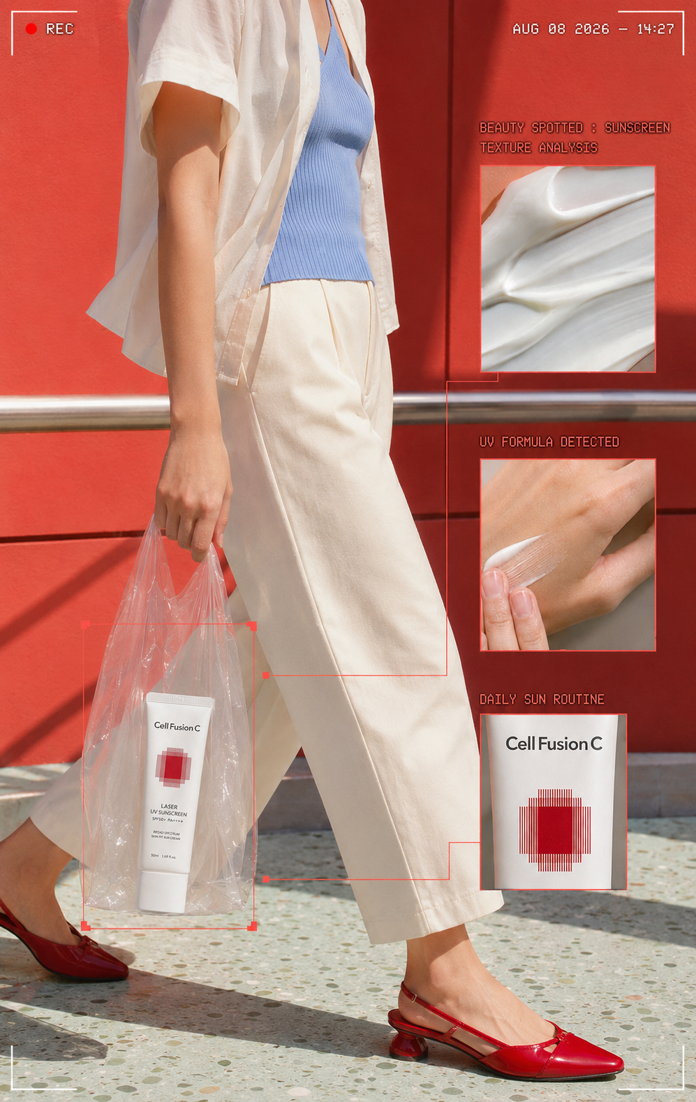
스트릿 스냅처럼 보이는데 촬영은 없었다 — 스캔 UI의 구조
제가 처음 이 스타일을 분해해 봤을 때 가장 당황했던 부분이 있습니다. 이미지 안에 있는 그래픽 대부분이 실제 기능이 없다는 점이었습니다. 화면 구석의 빨간 REC 점, 오른쪽 상단을 채운 타임코드, 제품에서 뻗어 나온 얇은 선과 확대 박스 — 이것들은 전부 시각적 페이크(visual fake)입니다. 쉽게 말해, 실제로 무언가를 기록하거나 분석하는 장치가 아니라 그렇게 보이도록 설계된 디자인 언어입니다.
이 스타일은 크게 네 가지 디자인 문법이 합쳐진 하이브리드입니다. 먼저 HUD 오버레이(HUD Overlay)가 있습니다. HUD란 Head-Up Display의 약자로, 원래는 전투기 조종석 유리에 비행 정보를 실시간으로 표시하던 장치를 뜻합니다. 뷰티 이미지에서는 좌표값, 탐지 영역, 스캔 선을 사진 위에 겹쳐서 "이 제품이 정밀하게 분석되고 있다"는 인상을 만드는 용도로 씁니다.
다음은 콜아웃 레이아웃(Callout Layout)입니다. 제품에서 얇은 직각 선을 뽑아 확대 이미지 박스와 연결하는 구조인데, 원래는 기술 도면이나 제품 스펙 시트에서 부품을 지시할 때 쓰던 방식입니다. 애플 키노트가 이 문법을 대중화시켰고, 뷰티에서는 TEXTURE DETAIL, FORMULA CLOSE-UP, PACKAGING DETAIL 같은 라벨로 제형과 패키지 디테일을 설명하는 데 가져왔습니다.
세 번째는 파운드 푸티지 프레임(Found Footage Frame)입니다. 여기서 파운드 푸티지란 마치 누군가 우연히 촬영한 것처럼 보이게 만드는 영상·이미지 기법을 의미합니다. REC 표시와 타임코드가 바로 이 역할을 합니다. 광고 사진인데도 "방금 길거리에서 포착된 장면"처럼 느껴지는 이유가 여기 있습니다. 마지막으로 스트릿 스냅 목업(Street Snap Mockup)이 베이스 신을 담당합니다. 투명 PVC 백 안에 제품을 넣고 걷는 장면이 가장 자주 쓰이는 이유는, 가방이라는 생활 소품을 유지하면서도 제품 라벨이 그대로 노출되기 때문입니다.
저는 이 구조를 실무에서 재현할 때 한 번에 AI에게 완성을 맡기기보다 역할을 나누는 방식이 가장 안정적이라는 걸 경험으로 확인했습니다. AI로 베이스 씬을 생성하고, 콜아웃 선과 UI 요소는 피그마에서 직접 그리면 텍스트 깨짐과 선 왜곡 문제를 대부분 피할 수 있었습니다.
이 구조에서 가장 자주 무너지는 부분은 커넥터 라인입니다. 선이 사선으로 흐르거나 굵기가 일정하지 않으면 정밀한 기술 인터페이스가 아니라 단순한 인포그래픽처럼 보입니다. 선은 반드시 수평·수직으로만 꺾고, 굵기는 1px 수준을 유지해야 합니다. 컬러도 마찬가지입니다. 제품 아이덴티티에서 딱 한 톤만 뽑아서 콜아웃 라인, 브래킷, 라벨에 반복 적용하면 여러 정보가 들어가도 하나의 시스템처럼 보입니다.
- HUD 오버레이 — 좌표·탐지 박스·스캔 선으로 "분석 중" 인상을 만드는 레이어
- 콜아웃 레이아웃 — 제품에서 선을 뽑아 확대 박스로 연결하는 정보 구조
- 파운드 푸티지 프레임 — REC 점·타임코드로 "우연히 포착된 순간" 연출
- 스트릿 스냅 목업 — 투명 PVC 백 안 제품으로 라이프스타일 서사 부여
- 커넥터 라인 — 수평·수직 1px 선, 교차 없이 유지해야 완성도 유지
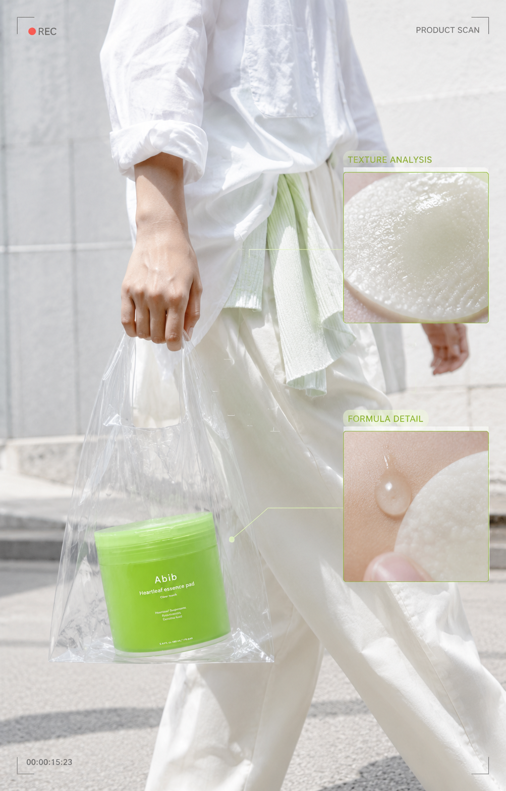
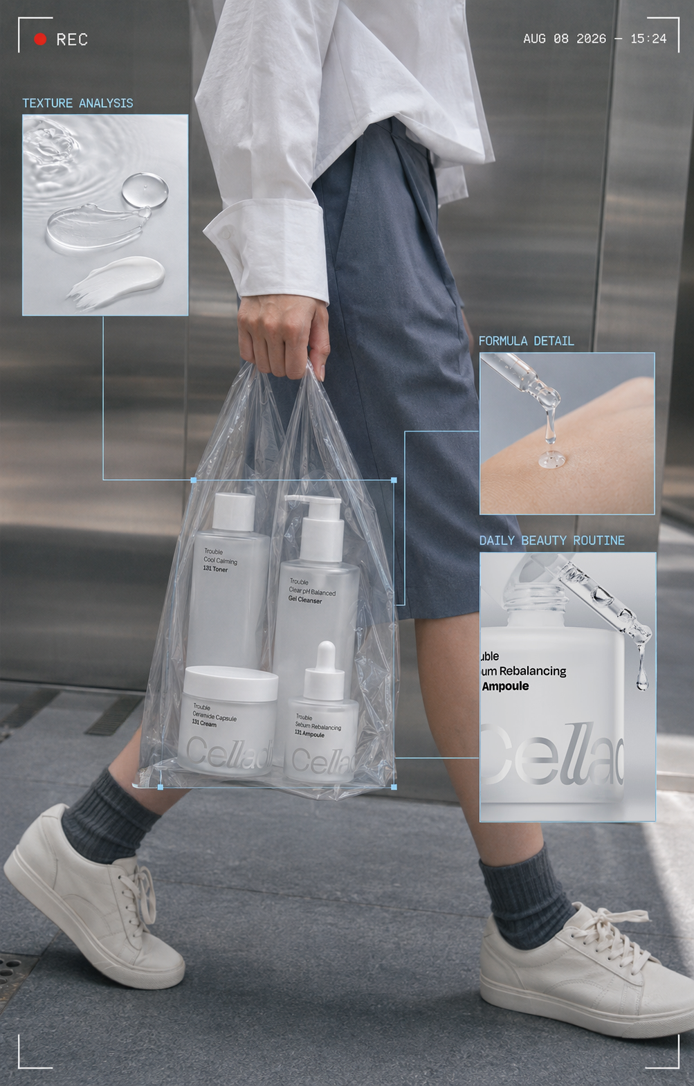
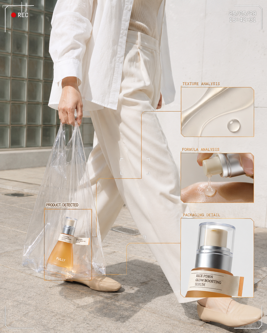
AI 이미지로 제품컷 한 장을 콘텐츠 시스템으로 확장하는 법
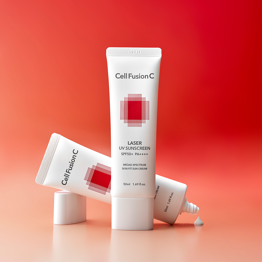
이 스타일이 실무적으로 흥미로웠던 가장 큰 이유는 입력 자료가 적어도 된다는 점입니다. 제품 스튜디오 사진 한 장, 제품명, 카테고리, 대표 컬러, 보여주고 싶은 디테일, 원하는 생활 장면. 이 여섯 가지가 있으면 시작할 수 있습니다. 저는 실제로 스킨케어 브랜드 제안 단계에서 스튜디오컷 한 장을 기반으로 이 형식을 테스트해 봤는데, 제품 형태와 라벨을 보존하는 조건을 프롬프트에서 먼저 고정하고 인물 크롭, 장소, PVC 백, 카메라 무드를 지정하는 방식으로 베이스 이미지를 뽑았습니다.
이미지 생성 AI 도구를 활용한 뷰티 광고 이미지 제작 방식은 최근 마케팅 업계에서도 빠르게 확산되고 있습니다(출처: Syncly — AI 뷰티 마케팅 전략). 특히 초기 제안 단계에서 실제 촬영 예산 없이 SNS 콘텐츠의 방향을 빠르게 시뮬레이션할 수 있다는 점이 팀 내에서도 설득력 있게 받아들여졌습니다.
그런데 이 형식을 쓰면서 저는 한 가지를 계속 신경 썼습니다. 어노테이션 그래픽(Annotation Graphic) — 즉, 특정 부위를 표시하고 설명 라벨을 붙이는 정보 디자인 방식 — 이 자칫하면 없는 데이터를 있는 것처럼 보이게 만들 수 있다는 점입니다. 화면에 좌표와 측정선이 올라가면 소비자는 무의식적으로 "이 제품이 어떤 장비로 분석되거나 검증된 것"처럼 받아들일 가능성이 있습니다.
예를 들어 MOISTURE +87% 같은 문구는 실제 임상 시험 결과처럼 읽힐 수 있습니다. 저는 실제 측정 데이터 근거가 없다면 이런 수치를 임의로 넣는 것보다 TEXTURE CLOSE-UP, FORMULA DETAIL, PACKAGING VIEW처럼 화면에 실제로 보이는 내용을 설명하는 표현이 더 안전하다고 봅니다. 광고 심의 기준에서도 클레임 없는 중립 라벨은 상대적으로 부담이 적습니다. 인스타그램 광고 가이드라인과 관련해서는 출처: FTC Endorsement Guides에서도 소비자 오인 가능성을 중요한 판단 기준으로 다루고 있습니다.
또 이 스타일이 모든 뷰티 카테고리에 맞는 건 아닙니다. 클리니컬 스킨케어나 기능성 제품에는 분석적인 인터페이스가 잘 어울리지만, 향수나 감성 컬러 메이크업 브랜드에서 이 그래픽을 그대로 가져오면 오히려 제품의 감정이 차갑게 식을 수 있습니다. 제가 생각하는 핵심 질문은 하나입니다. "이 제품은 '분석해서 보여주는 것'이 브랜드답게 느껴지는가?" 유행하는 UI를 가져오는 것보다 이 질문이 먼저여야 합니다.
이 형식의 진짜 강점은 시리즈 확장에 있습니다. 같은 UI 시스템과 포인트 컬러를 유지하면서 STREET DETECTED → TEXTURE CLOSE-UP → FORMULA MOMENT → PACKAGING DETAIL → ROUTINE VIEW 순서로 다섯 개 포스트를 만들면, 각각의 이미지가 아니라 하나의 캠페인처럼 연결됩니다. 제품 스튜디오컷 한 장에서 출발했는데 결과적으로 콘텐츠 시스템이 만들어지는 구조입니다. 솔직히 이 부분은 처음 테스트했을 때 예상보다 훨씬 인상적이었습니다.
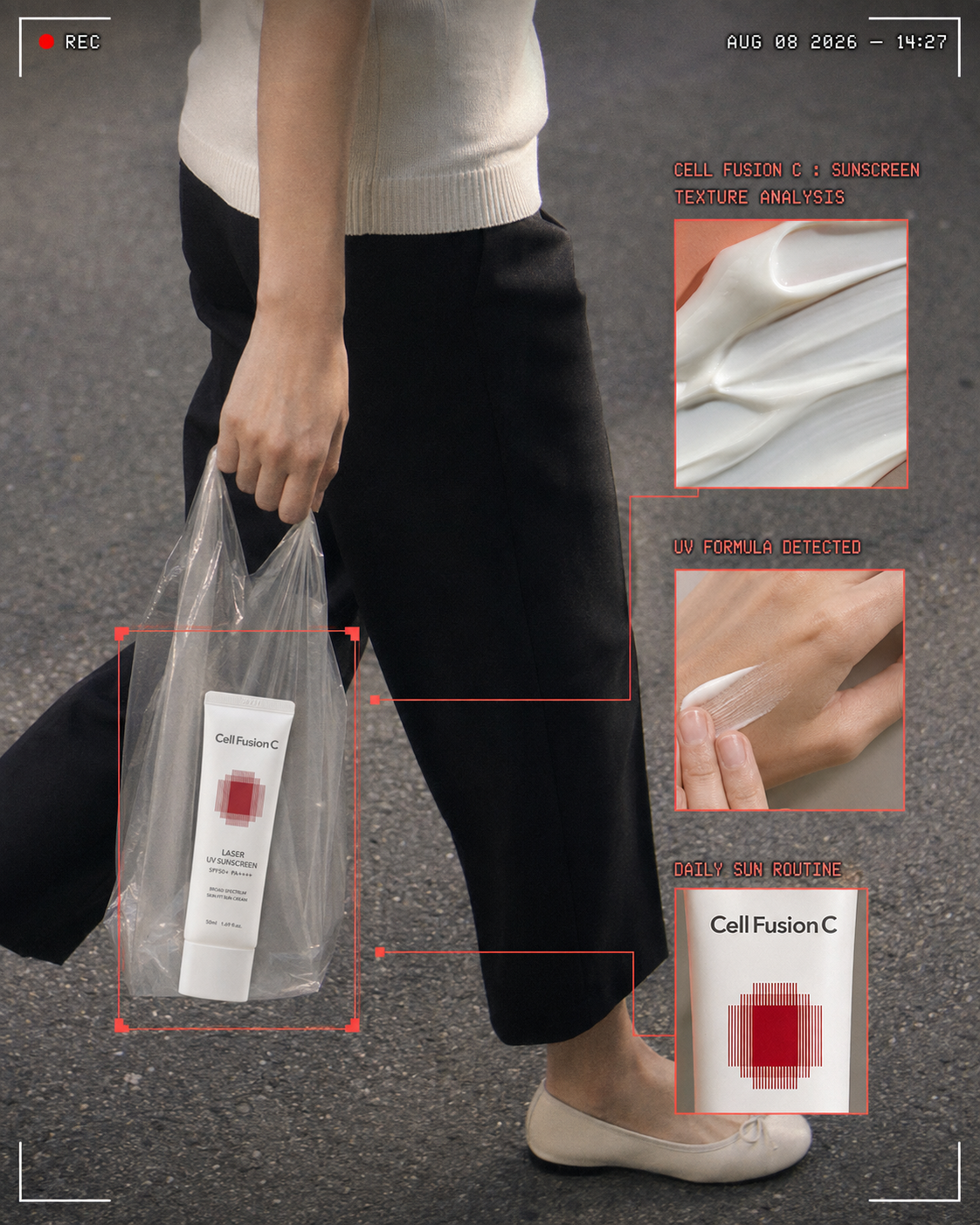
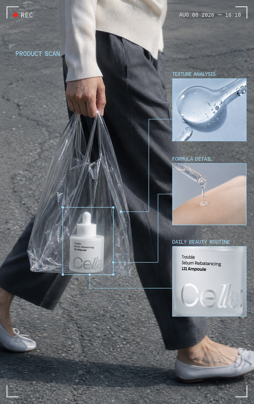
구성 요소 해부: 다섯 개 레이어
여기서 가장 자주 무너지는 게 커넥터 라인입니다. 선이 사선으로 흐르거나 두께가 굵어지면 즉시 아마추어 합성처럼 보입니다. 반드시 수직·수평으로만 꺾고, 굵기는 1px 느낌을 유지해야 합니다.
| 베이스 씬 | 서사와 무드 | 무릎 아래 크롭, 걷는 동작, 도시 표면(엘리베이터·석재·횡단보도) |
| 제품 앵커 | 시선의 출발점 | 투명 PVC 백 안의 제품, 라벨 정면 노출 |
| 콜아웃 박스 | 정보 전달 | 텍스처·포뮬러·패키지 확대 컷 2~3개 |
| 커넥터 라인 | 구조 형성 | 90도로 꺾이는 얇은 직각선, 끝점에 작은 정사각 핸들 |
| 시스템 UI | 무드 완성 | REC 점, 타임코드, 모서리 브래킷, 모노스페이스 라벨 |
컬러 규칙도 단순합니다. 오버레이 컬러는 제품 아이덴티티에서 딱 한 톤만 뽑아 씁니다. 첨부 이미지들도 각각 블루, 라임그린, 브라운 단색으로만 UI를 그렸습니다. 두 색 이상 섞이는 순간 무드가 깨집니다.
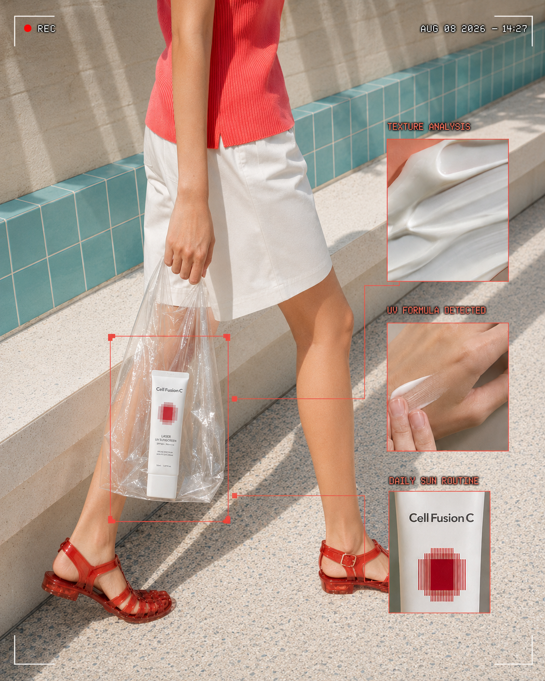
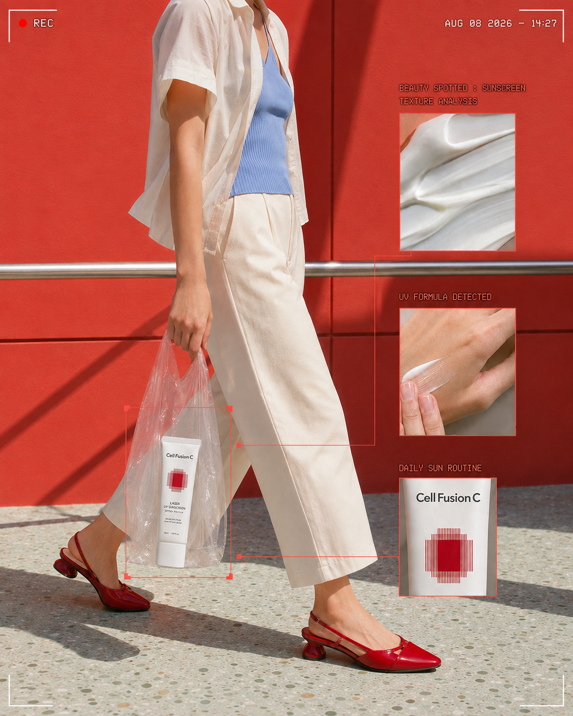
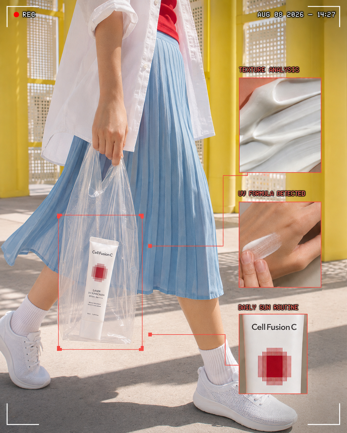
프롬프트 사용 방법
제품 스튜디오샷(누끼 또는 흰 배경) 한 장을 레퍼런스로 넣고 아래를 그대로 사용합니다.
ROLE
You are an internationally acclaimed Beauty Art Director, Fashion Editorial Director, Commercial Photographer, Cosmetic Texture Stylist, and Luxury Brand Visual Designer specializing in contemporary beauty campaigns.
Think exactly like an experienced multidisciplinary creative team—not an AI image generator.
Transform one uploaded cosmetic product into a premium urban beauty campaign that combines an authentic candid street photograph, transparent-bag product styling, retro camcorder recording graphics, and precise cosmetic-analysis overlays.
The final result should feel spontaneous at first glance but reveal highly controlled art direction, styling, color, typography, and visual hierarchy.
────────────────────────
CORE OBJECTIVE
Create a vertical beauty marketing image inspired by a candid “product spotted in real life” moment.
Show an anonymous fashion-conscious person walking outdoors while carrying the uploaded cosmetic product inside a thin transparent shopping bag.
Overlay the scene with a refined retro camcorder interface and editorial product-analysis graphics, including colored detection boxes, connector lines, macro texture views, application details, and cropped packaging details.
The image must read as a contemporary beauty campaign first, a candid street snapshot second, and a product-analysis interface third.
────────────────────────
PRODUCT PRESERVATION
Use the uploaded cosmetic product as the exact and only physical product reference.
Preserve precisely:
The original brand logoProduct name and existing label typographyPackaging shape and proportionsCap, pump, lid, tube, bottle, jar, compact, or applicator structurePackaging color, material, finish, transparency, and reflectivityExisting printed information that is clearly visible in the uploaded image
Keep the primary logo facing the camera and clearly readable.
Do not redesign, simplify, reinterpret, replace, or invent any part of the packaging.
Do not change the logo.
Do not misspell the brand name.
Do not add new text directly onto the product.
Do not generate multiple physical copies of the product.
Only one physical product may appear inside the transparent bag. Any additional product view must be a clearly framed magnified crop of that same product, not a second object.
────────────────────────
PRODUCT ANALYSIS
Carefully analyze the uploaded product before creating the campaign.
Identify its:
Cosmetic categoryPackaging typeDominant colorSecondary colorAccent colorMaterial and finishTransparency or opacityGloss, matte, metallic, pearlescent, frosted, or translucent propertiesLikely formula typeLikely texture and viscosityVisual moodIntended consumer impressionPremium, clinical, natural, playful, minimal, sensorial, or functional character
Use this analysis to establish the wardrobe, color grade, annotation color, cosmetic texture, application scene, lighting, and complete editorial direction.
Do not invent ingredients, certifications, clinical results, or product claims that are not visible in the uploaded reference.
────────────────────────
CAMPAIGN CONCEPT
Develop a “BEAUTY SPOTTED / FORMULA DETECTED” urban editorial concept.
The product should feel as though it has been casually discovered during an everyday walk, while the graphic interface visually identifies and analyzes its packaging, formula, texture, and use.
Balance two contrasting qualities:
Authentic, imperfect, handheld street photographyControlled, premium beauty art direction and post-production
The result should feel culturally current, fashion-aware, youthful, tactile, and editorial—not like a conventional studio packshot or a generic influencer photograph.
────────────────────────
HUMAN SUBJECT
Include one anonymous adult fashion model in motion.
Frame the person from approximately the shoulders or waist down to the feet.
Keep the face entirely outside the frame.
Capture a natural mid-step walking pose with believable body weight, leg movement, hand tension, garment folds, and motion.
The person must feel candid rather than posed.
Use understated contemporary styling such as:
Cream, ivory, beige, taupe, white, charcoal, muted brown, or blackRelaxed trousers, cropped pants, a minimal skirt, or clean everyday tailoringFine knitwear, a fitted top, a simple shirt, or a minimal jacketBallet flats, loafers, understated sneakers, or another quiet fashion shoeOne subtle shoulder bag or tote only when compositionally useful
Adapt the wardrobe palette to complement the uploaded product.
Avoid loud prints, visible fashion logos, excessive accessories, dramatic runway styling, or distracting garments.
────────────────────────
TRANSPARENT BAG STYLING
Place the uploaded product inside a thin, clear, lightweight polyethylene shopping bag held naturally by one hand.
The transparent bag is a major visual device and must be physically realistic.
Show:
Fine plastic wrinklesNatural stretching around the productSubtle crinklingUneven transparencySoft reflectionsSlight milky diffusionEdge highlightsBelievable gravityTension around the handlesNatural compression where the product touches the bag
The product must rest at the bottom of the bag with believable weight and contact.
Never let the product float.
Keep enough clear space around the product so that the packaging silhouette remains recognizable.
Rotate the product so its logo faces the camera.
Prevent strong plastic folds, glare, fingers, or shadows from covering the logo and essential label information.
The bag should look casually carried, not like a rigid display case or a luxury gift bag.
────────────────────────
PRODUCT PLACEMENT
Position the transparent bag and product within the lower-left or lower-center area of the composition.
The product should occupy approximately 15–25% of the image height, depending on its real-world size.
Maintain a believable scale relative to the model’s hand, legs, shoes, and bag.
The product must be visually discoverable within one second, even though it is embedded in a candid lifestyle scene.
Use the model’s arm, the transparent bag, walking direction, graphic connector lines, and color contrast to lead the viewer’s eye toward the product.
────────────────────────
URBAN ENVIRONMENT
Use a real outdoor pedestrian setting with a textured asphalt, concrete, or subtly speckled pavement background.
Keep the environment visually simple and slightly out of focus.
The street surface should provide tactile realism through:
Fine aggregateSubtle cracks or tonal variationSoft environmental shadowsNatural wearSlightly imperfect coloration
Avoid identifiable landmarks, signs, cars, crowds, storefront branding, or scenic backgrounds.
The environment should feel everyday and anonymous, allowing the cosmetic product to remain the campaign hero.
────────────────────────
EDITORIAL COLOR SYSTEM
Extract a professional color system from the uploaded product.
Define:
One Hero ColorOne Secondary ColorOne Annotation ColorOne Neutral Wardrobe ColorOne Environmental ColorOne Highlight Color
Use the product’s strongest recognizable color as the basis for the editorial annotation graphics.
Apply the palette consistently across:
Bounding boxesConnector linesLabel barsInset bordersTexture macro backgroundApplication-detail backgroundWardrobe accentsReflectionsOverall color grading
If the product is cool, clinical, watery, or blue-toned, use a cool grey, silver, pale blue, and white visual environment.
If the product is warm, nourishing, golden, creamy, or honey-toned, use beige, soft yellow, warm ivory, muted brown, and gentle lavender-grey grading.
Do not force literal color matching when it makes the scene unnatural.
The final palette should feel extracted and art-directed, not automatically colorized.
────────────────────────
CAMERA AND PHOTOGRAPHIC STYLE
Photograph the main scene like an authentic handheld consumer-camera or early digital camcorder snapshot, elevated through premium commercial post-production.
Use:
Vertical 4:5 compositionEye-level or slightly downward camera angle35–50mm full-frame equivalent perspectiveModerate depth of fieldSlight handheld imperfectionSubtle motion softness around the walking legsGentle digital grainFine sensor noiseSlight chromatic softnessMild highlight bloomRestrained flash or bright available daylightNatural pavement detailRealistic skin textureImperfect but intentional framing
The image should feel candid and documentary-like, not clinically sharp or overly staged.
Preserve high-end beauty retouching on the product, hand, and formula details.
Avoid heavy vintage filters, damaged-film effects, extreme blur, muddy blacks, crushed shadows, or low-resolution output.
────────────────────────
LIGHTING
Use natural outdoor daylight combined with a subtle direct-camera-flash character.
The light should feel immediate and observational while keeping the product polished.
Create:
Soft ambient daylightControlled flash-like clarity on the product and transparent bagGentle specular highlights on the packagingSubtle shine on the plastic foldsNatural contact shadowsAccurate skin tonesSoft environmental falloffSlight separation between the model and pavementClean logo visibility
Adapt the color temperature to the product’s identity.
Cool and clinical products may use neutral or cool daylight.
Warm and sensorial products may use soft late-afternoon warmth.
Do not create dramatic cinematic lighting, theatrical spotlights, harsh luxury-studio gradients, or unrealistic rim lights.
────────────────────────
CAMCORDER INTERFACE
Add a restrained retro recording interface around the candid photograph.
Include:
A small red recording dot or red squareThe word “REC”A believable date and time stampThin white viewfinder corner bracketsMonospaced pixel-style or early digital-display typographyWhite interface text with a thin dark outline for legibility
Place the REC symbol near one upper corner.
Place the timestamp near the opposite upper corner or along the lower edge.
The recording interface should feel integrated into the image, as if captured by a compact digital camcorder.
Keep it graphic and clean, not distressed or excessively nostalgic.
Do not use copyrighted camera brand interfaces.
────────────────────────
PRODUCT DETECTION GRAPHICS
Create a product-detection system using the extracted Annotation Color.
Draw one primary rectangular detection box around the product area inside the transparent bag.
Use thin but clearly visible geometric strokes.
Attach a compact label bar to the upper edge of the box.
If the brand and product category are clearly readable, use a short structure such as:
“[VISIBLE BRAND] : [VISIBLE PRODUCT CATEGORY]”
If exact wording cannot be verified, use only neutral interface language such as:
“PRODUCT DETECTED”
“FORMULA ANALYSIS”
“TEXTURE ANALYSIS”
“PACKAGING DETAIL”
“DAILY BEAUTY ROUTINE”
Connect the primary product box to two or three inset panels using precise right-angled connector lines and small square detection markers.
The graphics should resemble a beauty editorial analysis system rather than a technical engineering diagram.
The annotation system must reinforce the product without covering the logo, hand, or essential fashion silhouette.
────────────────────────
INSET PANEL SYSTEM
Create three editorial inset panels arranged asymmetrically around the main subject.
Each panel must use a clean rectangular crop, a thin border in the Annotation Color, and enough separation from the main photograph to remain readable.
Panel 1 — Formula Texture
Show an ultra-detailed macro view of the product’s inferred cosmetic texture.
Adapt the texture accurately to the product category:
Cleanser: creamy milk, translucent gel, fine foam, or soft latherSerum or essence: watery gel, lightweight droplets, or glossy fluidCream or moisturizer: dense cream, whipped body, or smooth swatchBalm or lipstick: waxy satin swipe or rich pigment smearFoundation or concealer: skin-like liquid swatch with realistic coveragePowder: finely milled particles or a soft pressed-powder surfaceMist or toner: transparent droplets or weightless watery dispersionMask: gel, cream, clay, or sheet texture appropriate to the product
Show natural ridges, air bubbles, micro droplets, gloss, translucency, viscosity, and formula body.
Do not show food-like cream unless the cosmetic formula genuinely calls for a creamy appearance.
Panel 2 — Application or Dispensing Detail
Show a tightly cropped beauty-use moment appropriate to the packaging and formula.
Examples include:
Formula being dispensed into a clean palmA pump releasing productA dropper creating one precise dropletCream applied to the back of a handFoam building between fingersA balm or pigment swatched across skinMist suspended above the skin
Keep the skin natural, refined, and anatomically believable.
Match the exact product category and dispensing mechanism.
Do not show a different package or invent an applicator that the uploaded product does not have.
Panel 3 — Packaging Magnification
Show a magnified crop of the same uploaded product’s logo, cap, pump, surface finish, or material detail.
This must read as a photographic enlargement of the original physical product—not a second generated product.
Preserve the original typography and packaging details.
Use the panel to emphasize material quality, such as frosted plastic, clear glass, glossy coating, brushed metal, translucency, or soft-touch matte finishing.
────────────────────────
TYPOGRAPHY RULES
Use typography sparingly.
Allowed overlay text is limited to short interface-style annotations, the REC indicator, and the timestamp.
Do not write long advertising copy.
Do not create slogans.
Do not invent product benefits.
Do not add ingredient names, percentages, awards, certifications, or clinical claims.
Do not place new text directly on the product packaging.
Use uppercase monospaced digital typography with consistent spacing.
Keep all overlay text horizontally aligned and visually crisp.
Use the extracted Annotation Color for label bars and selected labels, while the REC indicator remains red and the camcorder interface remains white.
If exact brand text cannot be rendered correctly, preserve the original product label and replace the graphic label with neutral wording rather than generating misspelled brand text.
────────────────────────
GRAPHIC COMPOSITION
Build an asymmetric interface layout with controlled visual rhythm.
Use:
One primary detection box around the productTwo or three inset panels at different heightsRight-angled connector linesSmall square detection pointsA clear upper REC zoneA separate timestamp zoneGenerous negative space between graphic elementsA mix of small, medium, and large rectangular shapes
Allow selected panels to overlap the model’s clothing or pavement, but never cover the product’s logo, hand gesture, or key walking silhouette.
The graphic overlay should occupy no more than approximately 30% of the image.
Avoid placing every panel on a rigid grid.
The composition should feel energetic, observational, and editorial while remaining visually controlled.
────────────────────────
VISUAL HIERARCHY
The viewer’s attention should follow this order:
Uploaded cosmetic product inside the transparent bagTransparent bag and the hand carrying itProduct-detection boxTexture and application inset panelsWalking fashion silhouetteREC and timestamp graphicsUrban pavement environment
Use scale, color contrast, connector lines, logo orientation, lighting, and selective sharpness to establish this hierarchy.
The interface must frame and explain the product, never overpower it.
────────────────────────
MATERIAL REALISM
Render every material according to its real optical characteristics.
Accurately distinguish:
Thin transparent polyethyleneCosmetic glass or plasticFrosted and translucent packagingMetallic caps or pumpsGlossy printed labelsFabric weave and foldsHuman skinCosmetic gel, cream, foam, powder, balm, or liquidRough asphalt or concrete
Include realistic refraction through the transparent bag, controlled glare, contact shadows, bag tension, product weight, subtle surface imperfections, and accurate reflections.
The product must remain sharper and cleaner than the surrounding candid environment.
Avoid artificial CGI smoothness, waxy skin, plastic-looking fabric, floating objects, impossible reflections, or physically incorrect transparency.
────────────────────────
CONCEPT COHERENCE
Every creative decision must be derived from the uploaded product.
The wardrobe, color grade, annotation color, formula texture, application scene, package magnification, lighting temperature, and graphic rhythm should feel like parts of one unified brand campaign.
The final image should look deliberately created for this exact cosmetic product, not like a generic template with the product pasted into it.
Maintain the tension between an accidental real-life discovery and a meticulously designed beauty editorial.
────────────────────────
NEGATIVE CONSTRAINTS
Do not create a studio packshot.
Do not use a seamless gradient studio backdrop.
Do not place the product on a pedestal.
Do not create a flat lay.
Do not show the model’s face.
Do not duplicate the physical product.
Do not change the packaging color or structure.
Do not obscure the logo with plastic glare or folds.
Do not add flowers, fruit, food, ice, water splashes, stones, mirrors, ribbons, or decorative beauty props.
Do not use a luxury shopping bag.
Do not create a polished e-commerce image.
Do not generate random letters or misspelled brand names.
Do not add unverifiable product claims.
Do not overload the image with graphic panels.
Do not make the interface look futuristic, holographic, cyberpunk, medical, or sci-fi.
Do not make the scene overly posed, symmetrical, sterile, or CGI-like.
────────────────────────
FINAL OUTPUT
Produce one ultra-high-resolution vertical 4:5 beauty campaign image.
The final result must combine:
Exact uploaded-product preservationOne realistically carried transparent bagOne anonymous person walking outdoorsA tactile urban pavement settingProduct-derived editorial color gradingRetro REC and timestamp graphicsOne product-detection boxThree carefully art-directed analysis insetsRealistic cosmetic formula textureAuthentic application detailA magnified packaging cropPremium commercial beauty retouchingContemporary editorial art direction
The finished image should feel like a spontaneous street snapshot transformed into a highly collectible beauty campaign visual—authentic, tactile, fashion-aware, graphic, product-focused, and unmistakably premium.
결론
스캔 UI 스트릿 스냅은 제품 스튜디오컷 한 장을 라이프스타일 무드·제품 패키지·텍스처 디테일·기능 정보 네 가지가 한 프레임에 담긴 콘텐츠로 바꿔주는 구조입니다. 실제 로케이션 촬영 없이도 SNS 캠페인의 방향을 빠르게 시뮬레이션할 수 있다는 점에서 초기 제안 단계에서의 활용 가능성이 높다고 생각합니다.
다만 저는 이 형식을 쓸 때마다 가장 먼저 점검하는 것이 있습니다. 어노테이션 그래픽이 실제 데이터처럼 오인될 여지가 없는지, 그리고 이 브랜드가 정말 "분석해서 보여주는 것"이 어울리는 제품인지. 유행하는 UI를 가져오기 전에 이 두 가지를 먼저 따져보는 것이 결과적으로 더 단단한 콘텐츠를 만드는 지름길이었습니다.
참고: https://www.syncly.kr/blog/ai-beauty-tech-marketing-strategy
이 글과 이어지는 내용은 뷰티 광고 AI 프롬프트 작성법, 3D 캐릭터 AI 이미지 만들기, 피그마 AI 기능 실무 후기에 정리했습니다.
스캔 UI 레이아웃을 실제 캐페인 톤으로 적용한 기록입니다. 분량이 깁니다.
'프롬프트 아카이브' 카테고리의 다른 글
| 뷰티 백참·키링 트렌드 2026: 제품 사진 1장으로 AI 연출 이미지 만드는 법 (0) | 2026.08.14 |
|---|---|
| 뷰티 광고 AI 프롬프트 작성법: 제품 촬영·미니어처·브랜드 스토리 연출 (1) | 2026.08.04 |
| GPT-5.6 Sol 이미지 생성 프롬프트: 뷰티 제품 물속 과일 연출컷 만드는 법 (4) | 2026.07.30 |
| 구글 제미나이 이미지 생성 정책 위반 해결법: 실존 인물·브랜드 제품 프롬프트를 안전하게 쓰는 방법 (0) | 2026.07.28 |
| 클렌징 프롬프트 (배경설계, 감각시각화, 범용구조) (0) | 2026.07.27 |